Why WebP Is a Low‑Effort, High‑Impact Win for SEO

Images account for a large share of page weight, and on most mobile pages the LCP (Largest Contentful Paint) element is an image. That means shrinking image bytes is one of the fastest ways to improve real‑world loading and Core Web Vitals. WebP helps precisely here: at similar visual quality, it typically produces smaller files than JPEG/PNG, so your hero images, product cards, and featured images render faster—lifting UX, rankings, and conversions. Google’s guidance highlights that since images are often the LCP, optimizing image encoding and prioritization is among the most impactful improvements for CWV, with “always eager‑load the LCP image” as a cornerstone practice, per the 2024–2025 recommendations in the web.dev “Top Core Web Vitals improvements” explainer.
Why WebP, specifically?
Smaller at comparable quality:
Google’s format page reports that lossy WebP is about “25–34%” smaller than JPEG at similar SSIM/PSNR quality, and lossless WebP is roughly “26%” smaller than PNG (Google Developers, 2024–2025). See the authoritative summary in Google Developers: WebP image format.
Broad browser support:
WebP is supported across all major browsers, including Safari 14+; it’s effectively universal for the open web in 2025. Pairing WebP with responsive delivery ensures mobile devices don’t download oversized assets. For current compatibility context, Google’s page above and MDN/Can I Use both show near‑universal coverage.
Practical SEO impact pathway:
Since ~the majority of mobile pages have an image as the LCP element, cutting image bytes directly reduces LCP duration. This is summarized in the 2024 HTTP Archive/Web Almanac and reiterated in the web.dev CWV guidance (2024), which cites that optimizing images is among the highest‑leverage actions for LCP.
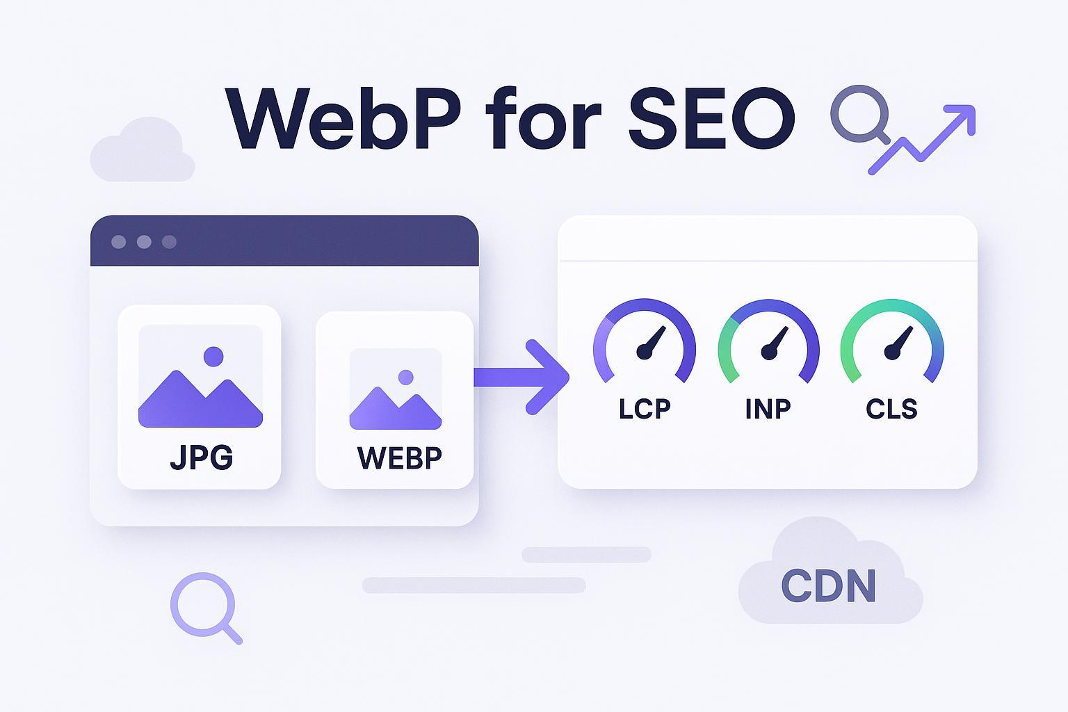
How WebP ties to LCP, INP, and CLS
LCP: Smaller files + correct priority = faster first meaningful render
Use WebP to reduce transfer size. Then ensure the LCP image is not lazy‑loaded and is given priority. Google recommends removing loading="lazy" from the LCP image and, when appropriate, adding preload or
fetchpriority="high"so the browser allocates bandwidth earlier, as advised in the web.dev Top CWV article (2024).
INP: Less contention improves responsiveness
Images aren’t JavaScript, but heavy image transfers delay page readiness, often increasing main‑thread and network contention. Slimmer WebP assets and better prioritization correlate with fewer input delays, a link discussed in web.dev’s Core Web Vitals guidance (2024).
CLS: Reserve space and keep aspect ratios
WebP doesn’t change layout by itself. Prevent CLS by always specifying
widthandheight(or CSSaspect-ratio) and delivering responsive sizes to avoid late resizing. The technique is detailed in MDN’s Responsive Images guide and reinforced in the web.dev CWV explainer.
When to use WebP—and when not to
Use WebP by default for photographic content and UI screenshots that can tolerate light compression.
Prefer SVG (or high‑quality PNG/lossless WebP) for logos, icons, and line art where crisp edges matter.
Consider AVIF for maximum compression or HDR photographic assets on modern browsers, but serve WebP/JPEG fallbacks for coverage.
Maintain JPEG/PNG fallbacks for legacy contexts (older Safari/email clients) using
<picture>.
A replicable 7‑step rollout plan for SMB teams
Follow this sequence to get measurable wins without heavy engineering.
1) Audit the current state
Extract all image URLs, intrinsic dimensions, and bytes per page. Identify the LCP element on each key template (blog post hero, landing page hero, product cards, featured images). Tools: Lighthouse, PageSpeed Insights, and field data from CrUX/Search Console CWV reports. The prevalence of image‑as‑LCP is highlighted in the web.dev CWV explainer referencing the 2024 Web Almanac.
Deliverable: A prioritized list of templates/elements by total bytes and LCP contribution.
2) Conversion & quality presets
Batch‑convert originals to WebP. Start with two presets:
Photographic: quality 70–80; adjust after visual QA.
Line art/UI: lossless WebP or keep SVG/PNG.
Keep original masters as fallbacks and for future AVIF encodes.
CLI examples (cwebp and ImageMagick):
# Photographic baseline
cwebp -q 75 input.jpg -o output.webp

# Attempt lossless (for UI/line art)
cwebp -lossless input.png -o output.webp

# ImageMagick example
magick input.jpg -quality 80 -define webp:method=5 output.webp
Tip: Spot‑check brand assets at 125%–150% zoom to catch subtle artifacts.
3) Responsive delivery with , srcset, and sizes
Use <picture> to offer WebP first with JPEG/PNG fallback, plus width‑based variants for different viewports. Include explicit dimensions to prevent CLS.
<picture>
  <source type="image/webp"
          srcset="/img/hero-320.webp 320w, /img/hero-640.webp 640w, /img/hero-960.webp 960w, /img/hero-1280.webp 1280w, /img/hero-1920.webp 1920w"
          sizes="(max-width: 768px) 90vw, (max-width: 1200px) 80vw, 1200px">
  <img src="/img/hero-1280.jpg"
       srcset="/img/hero-320.jpg 320w, /img/hero-640.jpg 640w, /img/hero-960.jpg 960w, /img/hero-1280.jpg 1280w, /img/hero-1920.jpg 1920w"
       sizes="(max-width: 768px) 90vw, (max-width: 1200px) 80vw, 1200px"
       width="1200" height="630" alt="Product hero">
</picture>
Reference techniques in MDN’s Responsive Images guide.
4) Loading strategy that protects LCP/INP
Do NOT lazy‑load the LCP image. Remove
loading="lazy"on that element. Consider a preload tag orfetchpriority="high"to accelerate fetch. The practice is emphasized in the web.dev “Top CWV” article (2024) and the browser‑level lazy loading guide (2024).Lazy‑load offscreen images with
loading="lazy"anddecoding="async".Defer decorative background images if possible.
Preload example for a hero image:
<link rel="preload" as="image" href="/img/hero-1280.webp" imagesrcset="/img/hero-640.webp 640w, /img/hero-960.webp 960w, /img/hero-1280.webp 1280w" imagesizes="(max-width: 1200px) 80vw, 1200px">
Or add priority directly on the img:
<img src="/img/hero-1280.webp" fetchpriority="high" alt="Product hero" width="1200" height="630">
5) Caching, CDN, and headers that scale
Serve via HTTP/2 or HTTP/3 for multiplexing and lower latency.
Use long cache lifetimes on fingerprinted filenames, e.g.,
Cache-Control: public, max-age=31536000, immutable.Set the correct MIME type:
Content-Type: image/webp(andimage/avifif used).If you negotiate formats by the browser’s
Acceptheader, addVary: Acceptso caches store distinct variants.Enable edge resizing/format negotiation when available.
Authoritative references: Cloudflare’s “Vary for images” configuration and Cloudflare Images edge transcoding; similar capabilities exist in Fastly Image Optimizer setup docs.
Example headers:
HTTP/2 200 OK
Content-Type: image/webp
Cache-Control: public, max-age=31536000, immutable
Vary: Accept
6) QA and monitoring
Validate diagnoses in Lighthouse and PageSpeed Insights: confirm the LCP element and rendered size.
Visual QA: scan critical templates for artifacts; raise quality for brand visuals.
Field monitoring: track LCP/INP/CLS in Search Console’s Core Web Vitals report and CrUX. The “optimize image encoding and priority” recommendation is reiterated in web.dev’s CWV guide (2024).
Target ranges to aim for (contextual, not guarantees):
25–40% reduction in total image bytes on photo‑heavy pages when moving from JPEG/PNG to WebP at similar perceived quality, per Google Developers’ WebP size comparisons.
300–800 ms LCP improvement on templates where the LCP is an image and properly prioritized; exact results vary by network, device, and template.
7) CMS and workflow integration
WordPress: WebP has been supported since 5.8; AVIF support arrived in WP 6.5 (2024) subject to server libraries. See the WordPress Core note on AVIF support (2024). Use reputable plugins (ShortPixel, Imagify, EWWW, Smush) to auto‑generate WebP/AVIF and deliver with fallbacks; add LCP preload or
fetchpriorityin your theme.Shopify: Use theme Liquid filters (e.g.,
image_url,img_url) to produce size variants and wire upsrcset/sizesin templates. See Shopify’s image best practices for responsive images and the Help Center overview of images. Confirm theme support for WebP delivery.Editor checklist (bake into onboarding): upload the largest clean source; write descriptive alt text; set focal point; preview mobile breakpoints; confirm no CLS; mark the LCP image for preload/priority.
Common pitfalls and fast fixes
Over‑compression on brand assets: Increase quality for logos/UI; use SVG or lossless WebP/PNG for crisp edges.
Missing fallbacks: Always provide a JPEG/PNG in
<img src="…">after the WebP<source>in<picture>; pattern shown in MDN’s guide.Wrong MIME type or blocked delivery: Ensure
Content-Type: image/webpat origin/CDN; verify that security middleware isn’t strippingVary: Accept. See Cloudflare’s image variants docs.Ignoring responsive images: Add width‑based
srcsetand template‑specificsizes. Prevent mobile from downloading desktop widths; see MDN responsive images.Lazy‑loading the LCP image: Remove
loading="lazy"from the LCP element; considerfetchpriority="high". Guidance from web.dev CWV article (2024) and browser‑level lazy loading.Skipping cache/CDN policies: Set long cache lifetimes for fingerprinted files and enable edge resizing/format negotiation. References: Fastly IO setup and Cloudflare Images docs.
CLS from missing dimensions: Always set
widthandheightoraspect-ratio. Reinforced in web.dev CWV guidance.
Your tools and stack options (neutral)
For SMB teams, practical choices include: WordPress with ShortPixel/Imagify/EWWW; Shopify with an image optimization app (e.g., Crush.pics) and theme srcset; Webflow/Duda/Wix (many optimizations are built‑in); and QuickCreator for managed publishing with SEO‑friendly templates. Disclosure: QuickCreator is our product; we include it neutrally among peer options.
According to cross‑industry summaries, better CWV correlates with improved SEO and business outcomes; for example, industry guidance often cites “around 1% conversion lift per 100ms” improvements—see this framing in the Relevant Audience overview (2024). Also see the broader CWV‑SEO linkage summarized by agencies like Riithink’s Core Web Vitals discussion (2024).
Implementation on common stacks (examples)
WordPress example
Install a reputable optimizer (e.g., ShortPixel or Imagify), enable WebP/AVIF generation and delivery, and set your global quality preset (start at 75–80). In your theme, mark the hero image as LCP and add
fetchpriority="high". If you use AVIF, ensure your host supports it (GD/ImageMagick), per WordPress 6.5 AVIF support notes (2024).
Shopify example
In section templates, output
srcset/sizeswith Liquid and generate width variants viaimage_url. Preload the hero variant for the expected viewport. Follow Shopify’s responsive images best practices and confirm that your theme or CDN serves WebP where supported.
QuickCreator example
For managed publishing, QuickCreator can streamline templates and hosting. If native image automation is not enabled in your plan, pair your site with a CDN that provides automatic format negotiation (WebP/AVIF), edge resizing, correct
Content-Type,Vary: Accept, and long‑lived caching. This setup lets content teams focus on upload quality and alt text while infrastructure handles delivery.
Measurement framework you can present to stakeholders
Baseline (week 0):
For each key template, capture: total image bytes/page, LCP at the 75th percentile (field data if available), INP, CLS, plus the LCP element and its resource size.
Rollout: Convert assets to WebP, implement responsive delivery, fix loading priority for LCP, set CDN headers, and ship.
Follow‑up (weeks 2–4, after traffic stabilizes):
Record the delta in total image bytes/page and LCP (ms) per template.
Track the change in “Good URLs” in Search Console’s CWV reports.
Optionally, monitor changes in crawl stats, indexation velocity, and conversion rate; attribute cautiously because other variables affect outcomes.
Reporting targets and how to communicate them:
“We reduced image bytes by 28% on product listing pages and improved LCP by 420 ms at p75.” Targets align with the general savings ranges in Google’s WebP overview (2024–2025) and the focus on image‑as‑LCP in web.dev’s CWV explainer (2024).
Tip: Use CrUX history in the Chrome UX Report or Search Console CWV to visualize trends month‑over‑month.
A note on case evidence and how to run your own test
Public, WebP‑only case studies with complete p75 LCP and CWV pass‑rate deltas are uncommon because teams often ship multiple optimizations at once (priority, JS reductions, caching, etc.). Rather than rely on anecdote, treat the WebP rollout like an experiment:
Choose one high‑traffic template (e.g., product category). Baseline 28 days of field data.
Ship WebP + responsive + LCP priority changes only.
Hold other changes (JS, fonts) constant for 2–3 weeks.
Compare p75 LCP and total image bytes before/after. A realistic target band is 25–40% fewer image bytes and 300–800 ms faster LCP when the LCP is an image, grounded in Google Developers’ WebP size deltas and the web.dev emphasis on image‑as‑LCP (2024).
If your stakeholders need a business case slide, you can pair CWV improvements with commonly cited conversion sensitivity ranges (e.g., the “~1% per 100ms” heuristic used in industry discussions such as the Relevant Audience article (2024)). Treat that as directional, not deterministic, and, where possible, run your own A/B test.
Appendix: Quick copy‑paste snippets
Minimal
<picture>with fallbacks and dimensions:
<picture>
  <source type="image/webp" srcset="/img/card-320.webp 320w, /img/card-640.webp 640w, /img/card-960.webp 960w" sizes="(max-width: 768px) 90vw, 400px">
  <img src="/img/card-640.jpg" srcset="/img/card-320.jpg 320w, /img/card-640.jpg 640w, /img/card-960.jpg 960w" sizes="(max-width: 768px) 90vw, 400px" width="400" height="400" alt="Product card">
</picture>
Hero preload with variants:
<link rel="preload" as="image" href="/img/hero-1280.webp" imagesrcset="/img/hero-960.webp 960w, /img/hero-1280.webp 1280w, /img/hero-1920.webp 1920w" imagesizes="(max-width: 1200px) 80vw, 1200px">
Cache and content negotiation headers:
Cache-Control: public, max-age=31536000, immutable
Content-Type: image/webp
Vary: Accept
By choosing WebP and pairing it with responsive delivery, correct priority for the LCP image, and robust CDN caching, SMB teams reliably unlock faster loads and healthier Core Web Vitals—without replatforming or deep engineering. The technical “how” is now well‑documented by primary sources like Google Developers on WebP, the web.dev 2024 Core Web Vitals guidance, and implementation docs from CDNs such as Cloudflare and Fastly. When you execute the workflow above, you’ll have an audit trail, a repeatable process, and numbers your stakeholders can trust.