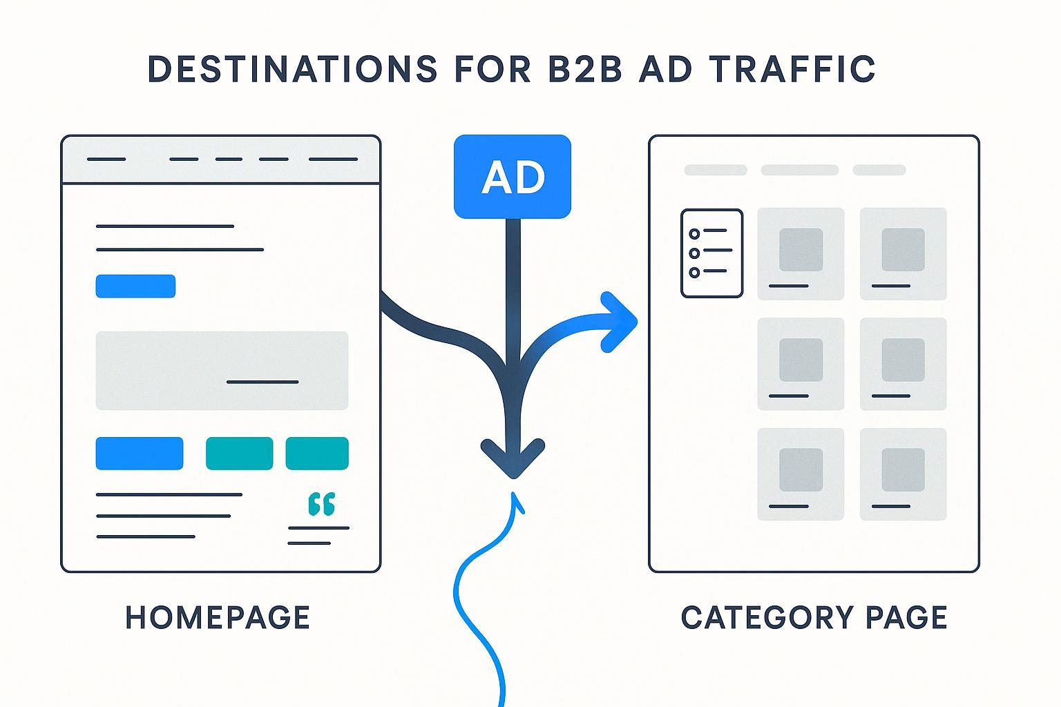
B2B Ads 2025: Homepage vs Product Category Page — What Should Be Your Landing Page?

If you’re running B2B ads, the “where should we send traffic?” question can make or break performance. Many teams default to the homepage. Others aim for a product category page. In practice, there’s a third option that often outperforms both: a dedicated, intent‑matched landing page. This guide compares homepage vs. category page specifically for B2B paid campaigns, and explains when a bespoke landing page is the smarter move.
Quick answer (by buyer stage)
- Awareness: Homepage can work if you add a campaign module and a single, clear CTA.
- Exploration: Product category page fits when buyers need to browse and compare a range of related solutions.
- Decision/conversion: Dedicated landing page usually wins—tight message match, focused CTA, reduced distractions.
Reality check: Don’t force a false choice. Use the destination that best matches intent and your campaign goal, then instrument it for speed, mobile UX, and testing.
How intent alignment drives the choice
B2B ads promise an outcome: a demo, a solution overview, a quote, an ROI improvement. Your landing destination must deliver on that promise—immediately and clearly.
- Homepage: Built for multiple audiences and intents. It’s a brand hub, not a single‑offer page. If you use it, add a campaign‑specific hero and one primary CTA above the fold.
- Product category page: Scoped for browse-and-compare behavior. It helps mid‑funnel buyers narrow choices across modules, SKUs, or solution tiers.
- Dedicated landing page: Designed for one action (demo, trial, webinar sign‑up, quote). Remove global navigation, match ad headline to H1, and keep forms short.
For ad‑to‑page continuity, make sure your keywords and creative align with the page’s content and CTA. If you need a primer on aligning paid keywords and search intent, this explainer on aligning keywords with search intent walks through practical patterns.
Data: What benchmarks say (and how to interpret them)
- Across industries, the median landing page conversion rate sits around 6.6% in recent reports, with email‑driven landing pages far higher (near 19%) according to the Unbounce Conversion Benchmark Report (2024–2025). Treat the medians as directional—your mileage will vary by offer, traffic source, and industry.
- Typical B2B site pages (not single‑offer landing pages) convert closer to ~1.1–3.5%. First Page Sage’s 2025 analysis breaks out traffic‑to‑lead rates by page type (e.g., service pages ~3.3%, application pages ~3.0%) in the First Page Sage 2025 website traffic‑to‑lead benchmark.
- Mobile matters: Many teams see mobile landing pages convert ~8% lower than desktop. Optimizing mobile speed and UX can close that gap, as highlighted in the 2024 summary of Unbounce’s data by Search Engine Journal on the mobile conversion gap.
- Speed is non‑negotiable. Aim for Core Web Vitals thresholds—LCP ≤ 2.5s, INP ≤ 200ms, CLS ≤ 0.1—per the Google Search documentation on Core Web Vitals (2025).
Interpretation: Homepages typically sit in the “general site page” bucket, with more distractions and lower intent match. Dedicated landing pages tend to outperform when the offer is clear and the message matches the ad. Category pages can do well for exploration campaigns if you add the right CRO features.
Homepage vs. Category Page: What really changes performance?
1) Intent match and clarity
- Homepage: Mixed intents; hard to make one offer feel primary. If you must use it, ship a campaign banner/hero with mirrored ad messaging and a single CTA (e.g., “Book a demo”).
- Category page: Naturally aligned to campaigns that promote a range. Use benefit‑led copy to orient buyers (“Compare compliance‑ready integrations for XYZ”).
2) Friction and distractions
- Homepage: High friction—navigation, multiple CTAs, varied content. Minimize competing paths above the fold.
- Category page: Medium friction—browsing still adds effort. Reduce friction via filters and comparisons.
3) CRO levers and control
- Homepage: Lower control (site‑wide nav and modules). You can still add a campaign module and tailor hero copy.
- Category page: Moderate control. Add filters, comparison blocks, sticky lead‑gen CTAs (“Request a quote,” “Talk to an engineer”).
4) Measurement and iteration
- Homepage: Harder to isolate impact; consider source‑based personalization and campaign IDs.
- Category page: Easier to test filters, CTA placements, and messaging modules; still shared across organic users.
Making a category page convert (B2B specifics)
Category pages shine when buyers need to compare options before talking to sales. To make them work for paid traffic:
- Filters & sorting: Align to buyer language (capacity, compliance, integration type). Reduce choice overload.
- Comparison modules: Let users compare specs side‑by‑side without opening multiple tabs.
- Benefit‑led copy: Focus on operational outcomes and ROI, not just features. For copy ideas and structure, see these effective marketing copy examples.
- Trust signals: Certifications, case studies, partner logos; place near CTAs.
- Lead‑gen CTAs: Prominent, sticky options like “Request a quote,” “Download the spec sheet,” “Book a demo.”
Evidence to consider: CRO case work shows form and CTA tweaks can deliver large lifts. For instance, OuterBox documented a +200% increase in deeper lead form completions in a 2024 life‑insurance quote flow after adjusting copy and progression labels, detailed in the OuterBox Fidelity Life CRO case study. In another case, they reported +239% form submissions after optimizing friction points for a media technology client, summarized within their CRO program pages on OuterBox’s ecommerce optimization portfolio.
Shopify’s enterprise guidance also emphasizes educational “content wheels” on product pages to lift engagement and add‑to‑cart rates—principles you can adapt for B2B category pages, as outlined in the Shopify Enterprise product page education article (2023).
If you must send traffic to the homepage
Sometimes the homepage is the only viable destination—brand awareness campaigns, short‑term constraints, or retargeting mixed audiences. Mitigate risk:
- Campaign‑specific hero: Mirror ad headline/subhead; one primary CTA.
- Minimize competing CTAs: Above the fold, keep a single path forward.
- Personalize by source/segment: Dynamic modules from UTM/source; surface relevant solutions.
- Speed & mobile discipline: Hit CWV targets and design mobile‑first. For a primer on responsive UX and SEO considerations, review this guide to responsive design and UX/SEO.
If your awareness creative uses curiosity hooks, this primer on teaser advertising explains when and how to convert intrigue into a clear next step.
Dedicated landing pages: Your conversion workhorse
When the campaign goal is a demo, trial, quote, or webinar, a bespoke landing page is usually the best choice.
Checklist:
- Remove global navigation.
- Match ad headline to H1. Keep a tight message match from keyword to page.
- Single primary CTA (secondary CTA can be supportive, not competing).
- Short forms (3–5 fields) and consider progressive profiling.
- Social proof near the CTA (logos, testimonials, case study snippets).
- Speed targets: LCP ≤2.5s, INP ≤200ms, CLS ≤0.1 (per Google Core Web Vitals).
- Mobile‑first layout and real‑device testing.
- A/B testing of headlines, CTAs, and hero layouts.
The performance upside isn’t just conversion rate: tighter relevance can improve Quality Score and reduce CPC—compounding your ROAS.
Measurement, ops, and testing discipline
- Segment by channel & audience: Build variants for LinkedIn vs. search; tailor for industries or personas.
- Instrument analytics: Clear success events (form submit, CTA click, chat start), source attribution, and lead routing.
- Speed budgets & CWV monitoring: Treat performance as a feature, not a checkbox.
- Progressive optimization: Ship fast, test continuously. Small wins stack.
Common pitfalls to avoid
- False choice: Limiting yourself to homepage vs. category page when a dedicated landing page would convert better.
- Message mismatch: Ad promises one thing; page headlines and CTAs say another.
- Too many paths: Especially on the homepage; pick one next step for the campaign.
- Neglecting mobile: A sizable share of B2B traffic will be mobile; don’t treat mobile as an afterthought.
- Under‑instrumented pages: Without clear events and routing, you can’t learn or scale.
Also consider: Building and optimizing fast
If you need to ship tailored pages quickly and iterate with analytics, consider using QuickCreator to generate and optimize landing experiences across languages with a simple block‑based editor and automatic SEO. Disclosure: QuickCreator is our product.
How to choose (summary)
- Use the homepage for short‑term awareness or when resources are limited—add a campaign hero and a single CTA.
- Use a product category page for exploratory campaigns where buyers must compare related solutions—add filters, comparison modules, benefit‑led copy, social proof, and lead‑gen CTAs.
- Use a dedicated landing page for lower‑funnel goals—focus the page on one offer, remove distractions, and match the ad to the page.
Pick the destination that aligns best with your intent, then optimize for speed, clarity, and continuity. That’s how B2B ad dollars turn into qualified pipeline.