5 Steps to Design Eye-Catching Funnel Infographics for Presentations

Understanding Funnel Infographics
When it comes to funnel infographics, they play a crucial role in visual storytelling. These infographics are not just visually appealing but also serve a significant purpose in conveying information effectively.
Importance of Funnel Infographics
Enhancing Data Visualization: Funnel infographics help in presenting complex data in a simplified and visually engaging manner, making it easier for the audience to grasp key insights.
Simplifying Complex Information: By breaking down intricate processes into a step-by-step visual representation, funnel infographics simplify complex information, aiding in better understanding.
Engaging Your Audience: Visual elements like funnels attract attention and keep the audience engaged throughout the presentation, ensuring better retention of information.
Types of Funnel Infographics
Linear Funnel Design: Represents a straightforward flow from one stage to another, ideal for showcasing a sequential process.
Multi-Step Funnel Design: Allows for multiple paths or outcomes within the funnel, accommodating various scenarios or options.
Inverted Funnel Design: Flips the traditional funnel orientation, highlighting prioritization or filtering processes effectively.
Benefits of Using Funnel Infographics
Tracking Customer Journey: Funnel infographics provide a clear visualization of the customer's progression through different stages, helping businesses analyze and optimize their marketing strategies.
Improving Sales Conversion: By visually mapping out the sales process, organizations can identify bottlenecks and areas for improvement to enhance conversion rates effectively.
Enhancing Marketing Strategies: Utilizing funnel infographics enables marketers to tailor their strategies based on data-driven insights, leading to more targeted and successful campaigns.
Choosing the Right Tools
In the realm of infographic design, selecting the appropriate tools can significantly impact the quality and efficiency of your creations. Let's explore two popular platforms, [Google Slides* and *PowerPoint](https://graphicmama.com/blog/google-slides-vs-powerpoint/), along with considerations for choosing between free and premium tools.
Exploring Google Slides for Infographics
Utilizing Google Slides Templates
When diving into infographic creation, leveraging pre-designed Google Slides templates can serve as a solid foundation. These templates offer a range of styles and layouts to kickstart your design process efficiently.
Customizing Infographics in Google Slides
One of the standout features of Google Slides is its user-friendly interface, allowing for seamless customization. From adjusting colors to adding text and visuals, this platform provides a versatile toolkit for personalizing your infographics.
Exporting and Sharing Your Infographics
Once your masterpiece is ready, Google Slides enables you to export your infographics in various formats like PDF or image files. Sharing options include direct links or collaborative editing, making it convenient to showcase your work.
Leveraging PowerPoint for Infographic Design
Accessing PowerPoint Templates
Similar to Google Slides, PowerPoint offers a plethora of templates tailored for infographic design. These templates cater to different themes and purposes, providing flexibility in choosing the right style for your content.
Designing Infographics in PowerPoint
With its advanced functionalities, PowerPoint allows users to delve deeper into customization options. From intricate animations to precise object placement, this tool empowers creators to craft visually stunning infographics.
Exporting Infographics for Presentations
After finalizing your infographic design in PowerPoint, exporting options include saving as PDFs or images. This versatility ensures compatibility with various presentation platforms, enhancing accessibility for your audience.
Free vs. Premium Tools
When deciding between free and premium infographic tools, consider the unique advantages each offers:
Pros and Cons of Free Tools
Free tools like Google Slides provide accessibility and basic functionality without any cost implications. However, they may have limitations in terms of advanced features or exclusive design elements compared to premium alternatives.
Advantages of Premium Infographic Tools
Opting for premium tools unlocks a host of advanced features such as enhanced graphics libraries, interactive elements, and professional support. While these tools come at a price, they offer unparalleled creative possibilities and technical support for complex projects.
Making the Right Choice for Your Needs
Ultimately, the choice between free and premium infographic tools depends on your specific requirements and budget constraints. Evaluating factors like design complexity, collaboration needs, and long-term scalability can guide you towards selecting the most suitable tool for your infographic endeavors.
Design Tips for Impactful Infographics
When it comes to creating infographics that captivate your audience, design elements play a pivotal role in conveying information effectively. Let's delve into essential tips for crafting visually appealing and engaging infographics.
Color Psychology in Infographic Design
Color selection is more than just aesthetics; it influences how information is perceived and understood by viewers. Understanding color psychology can help you make strategic choices in your infographic design process.
Choosing the Right Color Palette
Selecting an appropriate color palette sets the tone for your infographic and evokes specific emotions in your audience. Consider using contrasting colors to highlight important data points and create visual interest.
Using Colors to Convey Information
Different colors can represent various concepts or categories within your infographic. For instance, warm tones like red and orange may signify urgency or excitement, while cool tones like blue and green evoke calmness or trust.
Creating Visual Hierarchy with Colors
Utilize colors to establish a visual hierarchy in your infographic, guiding the viewer's attention from key elements to supporting details. Bold, vibrant hues can draw focus, while muted shades provide background context.
Font Selection and Typography
Typography plays a crucial role in enhancing readability and conveying the tone of your content. Pay attention to font choices and styles to ensure clarity and coherence throughout your infographic design.
Importance of Readable Fonts
Prioritize legibility when selecting fonts for your infographic. Opt for clean, sans-serif typefaces that are easy to read at various sizes, ensuring that your message is accessible to all viewers.
Pairing Fonts for Contrast
Experiment with font pairings to create visual interest and hierarchy within your text elements. Combine serif and sans-serif fonts or vary weights to distinguish between headings, subheadings, and body text effectively.
Emphasizing Key Information with Typography
Use typography as a tool to emphasize critical data points or messages within your infographic. Employ techniques like bolding, italicizing, or increasing font size strategically to highlight essential information.
Incorporating Visual Elements
Visual elements such as icons, symbols, and graphics enhance the overall appeal and comprehension of your infographics. Thoughtfully integrating these components can elevate the storytelling aspect of your design.
Using Icons and Symbols Effectively
Icons and symbols serve as visual cues that aid in quick information processing. Choose universally recognizable icons or customize them to align with your brand identity while maintaining clarity.
Balancing Text and Visuals
Strike a balance between textual content and visual elements in your infographics. Avoid overcrowding with excessive text by supplementing information with relevant visuals that reinforce key points concisely.
Enhancing Infographics with Graphics
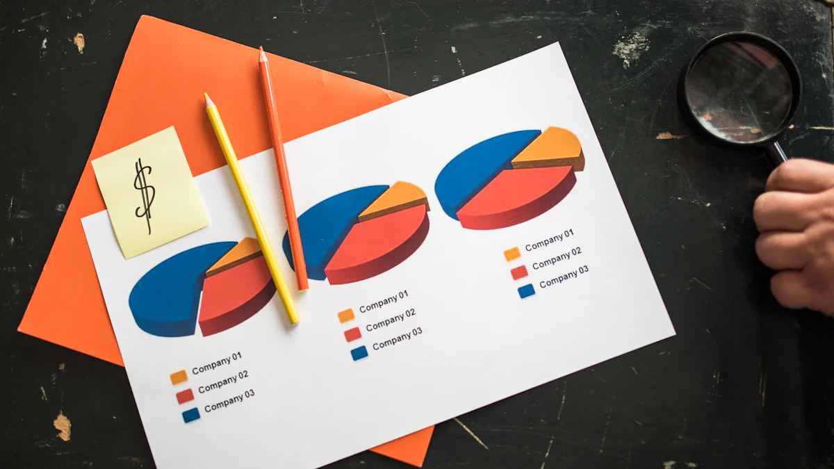
Graphics like charts, graphs, illustrations, or photographs add depth and context to your data presentation. Select graphics that complement your content theme and contribute meaningfully to the overall narrative flow.
Finalizing Your Infographic Design
Reviewing and Editing Your Infographic
After completing the initial design phase, it's crucial to meticulously review and edit your infographic for optimal presentation. Start by checking for consistency in design elements and ensuring accuracy in data representation. Seeking feedback from peers or colleagues can provide valuable insights for improvement. Make any necessary final adjustments to refine your infographic before sharing it with your audience.
Exporting and Sharing Your Infographic
When finalizing your infographic, consider the best practices for exporting and sharing it effectively. Choose the right file format, such as PDF or PNG, to maintain quality and compatibility across different platforms. Explore various online channels for sharing infographics, including social media, websites, or email newsletters. Present your infographic strategically to maximize its impact on viewers.
About the Author: Quthor, powered by Quick Creator, is an AI writer that excels in creating high-quality articles from just a keyword or an idea. Leveraging Quick Creator's cutting-edge writing engine, Quthor efficiently gathers up-to-date facts and data to produce engaging and informative content. The article you're reading? Crafted by Quthor, demonstrating its capability to produce compelling content. Experience the power of AI writing. Try Quick Creator for free at quickcreator.io and start creating with Quthor today!
See Also
Engaging Fun Facts to Increase Interaction in 2024
Top SaaS Landing Page Samples and Advice
Crafting a Polished Landing Page sans a Website