The Power of Statistical Evidence in Persuasive Writing: Unveiling Benefits and Challenges


Numbers share stories that words can't always explain. Using statistical evidence makes your arguments based on facts. This makes your message stronger and more believable. People trust numbers because they seem fair and true. Data makes hard ideas easier to understand. It helps people get your point fast. Statistics can also evoke emotions. For example, hearing "one in five kids goes hungry" creates care and concern. But it's important to use data honestly. Fake or unfair statistical evidence can break trust and ruin your message.
Key Takeaways
Facts and numbers make arguments stronger and more believable.
Numbers make hard ideas simple, so readers understand them easily.
Statistics use logic, making your points harder to argue against.
Mixing numbers with stories creates a strong and lasting message.
Use data from trusted sources to keep your arguments truthful.
Don’t use too much data; focus on the most important facts.
Explain your numbers so readers know why they matter.
Be honest with data; check facts and respect people’s privacy.
Understanding Statistical Evidence
What Is Statistical Evidence
Statistical evidence means using numbers to support your ideas. It includes things like percentages, averages, and facts you can measure. This type of proof helps make your arguments stronger. For example, saying "80% of people like online shopping" makes your point more believable. Numbers like this give your ideas a solid base.
Using statistics shows your claims are not just opinions. They are based on facts that can be checked. This makes your writing more reliable and convincing. Readers are more likely to trust you when they see your points are backed by real data.
The Role of Statistical Evidence in Persuasion
Statistical evidence is important for making your arguments convincing. It gives proof that is hard to argue against. When you use data from trusted sources, you build trust. Readers believe your message because it is supported by facts.
Here’s how statistical evidence helps persuade:
It gives solid proof for your arguments.
It makes your claims more believable and harder to doubt.
It appeals to readers' logic and reasoning.
It builds trust by showing your points are fact-based.
Good arguments often need evidence to convince others. Statistics explain your ideas clearly and make them stronger. Sharing data in a simple way helps your arguments work better.
Examples of Statistical Evidence in Writing
You can see statistical evidence in many kinds of writing. News stories, research papers, and ads often use numbers to prove their points. For example:
A health article might say, "70% of adults don’t sleep enough."
A business report could state, "Sales grew by 25% last quarter."
An environmental campaign might share, "Plastic makes up 80% of ocean trash."
These examples show how numbers make messages stronger. They simplify tough ideas and help readers see why your argument matters. Using statistics connects you with your audience by sharing facts they care about.
Benefits of Statistical Evidence

Boosting Credibility and Authority
Using numbers makes your writing more believable. Statistics show your ideas are based on facts, not guesses. People trust arguments with real data because it shows effort and research. For example:
Adding numbers to your claims shows you know your topic.
Articles with data-backed headlines are read 76% more often.
Including statistics in your work makes you seem reliable. Readers trust your message because it’s based on reality. Whether writing a report or an article, using data makes your points stronger.
Tip: Always pick numbers from trusted sources to keep your credibility.
Simplifying Complex Ideas
Numbers make hard ideas easier to understand. They turn big concepts into simple facts. For example, instead of saying "many like online shopping," say "80% like online shopping." This helps readers see how big the idea is.
Statistics also explain trends or patterns clearly. For example, saying "plastic is 80% of ocean trash" shows the problem clearly. Readers understand faster because numbers make the issue clear.
Note: Simple data doesn’t just teach—it grabs attention by being easy to follow.
Appealing to Logic and Rationality
Numbers appeal to readers’ logical thinking. They give proof that’s hard to argue with. For example:
Showing how homework improves test scores gives strong evidence.
Saying "80% of students plagiarize" is clearer than "many plagiarize."
Good arguments connect ideas clearly. Statistics help make these connections. You can use comparisons or cause-and-effect to support your points. For example, if you say exercise helps mental health, adding study data makes it convincing.
Tip: Use logical ideas with good statistics to make strong arguments.
Creating Emotional Impact with Numbers
Numbers can do more than share facts—they can touch hearts. When data connects with feelings, it becomes more than numbers. It turns into a story that inspires action. For example, instead of saying, "Millions lack clean water," say, "1,000 kids die daily from unsafe water." This change makes the statistic emotional and powerful.
Psychologist Jerome Bruner found stories help memory. People remember facts 22 times better when told as stories. Combining numbers with stories makes your message stick. For instance, tell about one family hit by a disaster. Add data showing many others face the same problem. This mix informs and creates a strong emotional bond.
The story of Alan Kurdi, a 3-year-old Syrian boy, shows this well. His photo went viral and brought attention to the refugee crisis. Numbers showed the crisis size, but Alan’s story made it personal. It reminded people that every number represents a real person.
Data storytelling is another great way to connect. Turn numbers into a story to show the issue’s impact. For example, instead of listing climate change stats, explain how rising heat forces farmers to leave their land. This approach informs and motivates people to care and act.
Adding personal stories to data makes it even stronger. For example, in a healthcare report, include a patient’s story with treatment success rates. This makes the data feel real and builds trust. People are more likely to connect with your message.
Using numbers to create emotional impact bridges logic and empathy. It helps your audience see the human side of data. This makes your arguments not just clear but also deeply meaningful.
Challenges of Using Statistical Evidence
Risks of Misinterpretation
Using statistical evidence can make your arguments stronger, but it can also be misunderstood. This happens when readers don’t know enough to understand the data. For example, a study on vaccine hesitancy showed people misunderstood safety statistics. Those with wrong information reacted more to numbers when they felt at risk. This shows how unclear data can confuse or mislead people.
To fix this, explain your data in simple words. Use charts or graphs to make your points clear. Think about what your audience knows before sharing statistics.
Tip: Don’t use hard-to-understand terms or tricky math. Keep it simple so everyone gets your message.
Overloading Readers with Data
Too much data can confuse your audience. If you share too many numbers, readers might feel lost or stop paying attention. Studies show that too much information can hurt decision-making and focus. For example:
Social media gives users too many posts, making it hard to keep up.
The Internet has endless facts, which can cause confusion.
Sharing too many numbers can make readers forget your main point.
Instead, pick only the most important statistics. Share them in small, easy-to-read sections. Use lists or tables to organize your data clearly.
Note: Less is better. Share fewer numbers but make them meaningful.
Lack of Context or Relevance
Numbers don’t work well without context. Statistics need explanations to help readers understand their importance. For example, saying "50% of people prefer online shopping" isn’t helpful unless you explain why it matters. Does it show a trend or a problem? Without context, readers might not see why the data is important.
Relevance matters too. If your numbers don’t connect to your audience, they won’t care. Always link your data to the topic and explain why it’s important. For example, if writing about climate change, use stats showing how it affects daily life.
Tip: Add real-life examples or comparisons to make your data meaningful. This helps readers understand the bigger picture.
Ethical Concerns in Data Usage
Using numbers in writing comes with responsibilities. You must ensure the data is correct, clear, and fair. Misusing numbers can confuse readers and hurt your trustworthiness.
One big concern is being honest. Always share where your data comes from and how it was gathered. For example, if you use a survey, explain who made it, who paid for it, and what questions were asked. Being open like this helps people trust your information.
Another issue is getting permission. If you collect data, tell people why and how it will be used. Participation should be a choice, and they should be able to quit anytime. Also, explain how you’ll keep their personal details safe.
Avoiding bias is also important. Don’t ask tricky questions or design surveys that change results. For example, the order of questions can affect answers. Use fair wording and check your results with proper tests to stay honest.
Keeping data safe matters too. Use secure ways to store information and limit who can see it. If data gets stolen, it can harm both the people involved and your reputation.
Lastly, admit when your data has limits. No study is perfect, so share any flaws or mistakes. If errors happen, fix them quickly and let your audience know. This shows you are responsible and trustworthy.
By handling these concerns well, you make sure your use of numbers is fair and reliable. Being ethical with data makes your arguments stronger and shows respect for your readers and the people behind the numbers.
Practical Tips for Using Statistical Evidence
Picking Trustworthy and Useful Data
Choosing good data is key to making strong arguments. Not all sources are trustworthy, so check them carefully. Ask yourself:
Does this source match my topic?
Check if the source has solid proof for its claims. Reliable sources often show where their facts come from. To be sure your data is correct, compare it with other sources. This is called triangulation and helps confirm your information is accurate.
Be careful with sources that seem reliable but are biased. For example, a company selling a product might show unfair data. Instead, use studies checked by experts or reports from neutral groups. Look at different views, like research papers and industry reports, to get balanced and trustworthy data.
Showing Data Clearly and Simply
How you share data is as important as the data itself. Clear presentation helps people understand your points quickly. Use visuals like graphs and charts to make your data interesting. Here are some common charts and their uses:
Bar Charts: Compare different groups.
Line Charts: Show changes over time.
Pie Charts: Display parts of a whole.
Scatter Plots: Show how things are connected.
Keep your explanation simple and focused. Break your argument into parts like the problem, cause, and solution. Use data to support each part. For example, if talking about climate change, a line chart of rising temperatures can help prove your point.
Match your explanation to what your audience knows. Skip hard words if they’re not experts. Explain your data in easy terms. Adding stories can also make your data more relatable. For example, pair a fact about hunger with a real person’s story to make it memorable.
Giving Meaning with Comparisons
Numbers alone don’t explain everything. Comparing data helps people see the full picture. For example, instead of saying, "10% of students failed," compare it to last year’s failure rate. This shows if things got better or worse.
Comparisons also show patterns and connections. For instance, comparing literacy rates between countries can show how education affects learning. Many studies use comparisons to make their results clearer. Tools like readability tests can check if comparisons improve understanding.
Use real-life examples to add meaning. For instance, if talking about healthcare costs, compare the price of a procedure in different areas. This makes your data easier to understand and more meaningful.
By choosing good data, sharing it clearly, and adding comparisons, you can use statistics to convince your audience effectively.
Balancing Statistics with Narrative Elements
Numbers alone don’t always inspire people to act. To make your ideas stick, mix statistics with stories. This mix connects logic with feelings, helping others understand and care about your message.
Why Balance Matters
Facts are important, but stories make them meaningful. Using both makes your message clear and interesting. For example, instead of saying, "20% of students struggle with reading," share a story about a student who improved with a reading program. This makes the numbers personal and encourages action.
Tip: Think of numbers as the bones of your argument and stories as the heart. Together, they make your writing stronger.
How to Combine Statistics and Stories
Experts say data storytelling is a great way to mix numbers and stories. Here’s how to do it:
Start with a hook: Use a surprising fact or touching story to grab attention.
Add context: Explain why the topic matters and give background details.
Share data: Show patterns or trends that support your point.
Explain meaning: Connect the data to the bigger picture.
End with action: Ask your audience to think, feel, or do something.
This plan helps guide readers through your ideas while keeping them interested.
Choosing the Right Visuals
Pictures and charts help balance numbers with stories. They make data easier to understand. But not all visuals work well. Pick ones that match your story and support your main idea. For example, a bar chart can show changes over time, while a pie chart shows percentages of a problem.
Note: Keep visuals simple. Don’t add too much detail that might confuse people.
Benefits of Data Storytelling
Data storytelling does more than share facts—it persuades. It grabs attention and helps people make better choices. By mixing numbers with stories, you can:
Make hard ideas easier to understand.
Create feelings that lead to action.
Build trust by showing facts and real-life examples.
For instance, if writing about climate change, pair stats on rising heat with a farmer’s story about losing crops. This shows the human side of the problem.
Balancing numbers with stories changes your writing. It turns boring data into powerful stories that teach, connect, and inspire. Use this method to make your ideas unforgettable.
Common Pitfalls to Avoid
Focusing Too Much on Numbers
Using too many numbers can hurt your message. Statistics give facts but lack feelings. Readers might get bored if your writing feels like a list of data. For example, saying "20% of students fail math" gives a fact but doesn’t explain why it matters. Without a story, the number feels empty.
You should mix data with stories. Stories make your message easier to connect with and remember. They show the people behind the numbers. For instance, instead of just saying how many students fail math, tell about one student who struggled but improved with help. This makes readers care and strengthens your point.
Tip: Use numbers as support, but let stories make your message real.
Using Old or Unchecked Data
Old or wrong data can hurt your trustworthiness. Readers believe you when your facts are correct and up-to-date. Outdated numbers make your points seem less important. For example, using a study from 1961 about study habits doesn’t match today’s world. Also, unchecked data can confuse readers and break their trust.
Here’s a table showing common mistakes and their effects:
Mistake | What Happens |
|---|---|
No clear purpose | Data seems less useful without showing why it matters. |
Missing relevance | Not linking data to the topic makes it feel unimportant. |
Poor citations |
To avoid these problems, always check your sources. Use recent and trusted studies. Cite your data so readers can confirm it. Proper citations build trust and make your points stronger.
Note: Always double-check your sources to ensure they are accurate and current.
Forgetting What Readers Know
Not thinking about what your readers understand can make your writing confusing. If your data is too hard, readers might feel lost. For example, a chart about study hours for different majors might confuse readers without an explanation.
Here’s a chart showing average study hours per week for different majors:
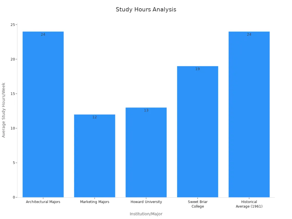
This chart shows study habits, but without context, readers might not get its meaning. Always explain what the numbers mean and why they matter. For example, you could say architecture students study twice as much as marketing students because their field is more demanding.
Tip: Make your data simple and explain it so readers understand its value.
Not thinking about your readers’ needs can make your writing less effective. Adjust your content to their knowledge level and explain your data clearly. This helps your message connect and stay with them.
Not Citing Sources Correctly
Citing sources isn’t just a rule—it builds trust. When you cite properly, readers see your ideas are based on real research. Without citations, your writing can seem weak and unreliable. People might doubt your claims if they can’t check the facts.
Not citing sources causes problems. First, it makes your work look less trustworthy. Readers might think you’re sharing opinions, not facts. Second, it creates confusion. If readers don’t know where your data comes from, they can’t understand its meaning. Lastly, it’s unfair. Using someone’s work without credit is plagiarism, which is a serious issue.
Citations also improve your writing. They guide readers to learn more about your topic. Citations explain tough ideas by linking them to other research. They also show you’ve thought carefully about different viewpoints. The table below shows why proper citation matters:
Benefit | What It Does |
|---|---|
Strengthens Arguments | Makes your points stronger with proven research. |
Adds Context | Helps readers understand the background of your data. |
Tracks Idea Growth | Shows how ideas and theories have changed over time. |
Highlights Key Sources | Points out the most important and reliable information. |
Combines Perspectives | Brings in ideas from different fields to enrich your writing. |
Encourages Critical Thinking | Helps you analyze research and improve your conclusions. |
To avoid mistakes, keep track of your sources while researching. Use tools like citation apps to format them correctly. Always include the author’s name and details when quoting or paraphrasing. If unsure, it’s better to cite than leave it out.
Citing sources shows respect for authors and readers. It makes your writing stronger by proving your points are based on facts. By citing, you build trust and support honesty in writing.
Striking a Balance with Statistical Evidence
Mixing Data with Emotional Stories
Combining numbers with emotions makes your arguments stronger. Data gives proof, but emotions help people care. For example, instead of saying, "10% of kids lack clean water," tell a story about one child facing this problem. Adding the story makes the issue feel real and urgent.
Studies show emotions work well in certain situations. People who are kind or careful often respond more to feelings than facts. This means you should adjust your approach based on your audience. If your readers value empathy, use stories to show the human side of your data.
Research suggests mixing emotions with facts can make messages stronger. Strong emotions work best when they match your audience’s beliefs. Reducing emotional content in opposing views can also prevent negative reactions.
Start with a touching story, then add data to back it up. This way, your message feels both trustworthy and relatable.
Knowing When to Use Numbers
Numbers are helpful, but they’re not always needed. Use them when they make your point clearer. For example, saying "50% of students struggle with math" is clearer than saying "many students struggle."
But don’t use numbers if they don’t fit the topic. For personal or emotional subjects, stories might work better. For instance, when writing about mental health, sharing someone’s experience can connect better than statistics.
Ask yourself these questions before using numbers:
Does this data make my point easier to understand?
Will my audience trust and understand these numbers?
Is there a better way to explain this idea?
By choosing when to use numbers, you keep your writing clear and focused.
Being Honest and Clear with Data
Honesty and clarity are key when using numbers. Readers trust you when your data is correct and easy to follow. Always check your sources to make sure they’re reliable. Use recent studies or trusted reports.
Clarity means explaining where your numbers come from and how they were gathered. For example, if you use a survey, say who did it and how many people took part. This builds trust and shows you’ve done your homework.
Never change numbers to fit your argument. Misleading data can ruin your credibility. Share the facts honestly, even if they don’t fully support your point. Readers respect honesty and are more likely to believe you.
By being honest and clear, you make your arguments stronger and keep your readers’ trust.
Using statistics can make your writing stronger and more trustworthy. It helps explain ideas clearly and adds emotional meaning. To use it well, follow these steps:
Make sure your numbers are correct and from trusted sources.
Avoid tricks that might mislead your readers.
Understand your audience’s worries and show you care.
Respect different opinions and talk kindly about them.
When you mix facts with fairness, your message becomes powerful. Use statistics carefully to teach, inspire, and connect with your readers.
FAQ
What’s the best way to find good data?
Use trusted sources like government sites, studies, or known groups. Check multiple places to make sure the data is correct. Don’t trust blogs or opinions without proof.
Tip: Websites ending in .gov, .edu, or .org are often reliable.
How can you make hard numbers easy to understand?
Use pictures like graphs or charts to explain data clearly. Break big numbers into smaller, relatable examples. For example, instead of "1 million people," say "1 in 10 people."
Why should you cite where your data comes from?
Citing sources makes your work trustworthy. It shows your facts are real and checked. Readers can also look at the original data for more details.
Note: Always include the author, date, and link when citing.
How do you mix stories with numbers?
Add personal stories to make numbers feel real. Start with a story people can relate to, then add data to back it up. This makes your writing both emotional and logical.
What mistakes should you avoid with statistics?
Don’t confuse readers with too many numbers. Avoid using old or unrelated data. Misleading stats or no context can hurt your trustworthiness.
How can you make data look interesting?
Use simple visuals like bar or pie charts. Keep designs neat and focused on one idea. Don’t add too much detail that might confuse people.
When should you skip using numbers?
Don’t use stats for very personal or emotional topics. Stories work better for these. For example, when talking about mental health, share personal experiences instead of lots of numbers.
What are the rules for using data fairly?
Always use correct and checked data. Be clear about where it’s from and don’t change numbers to fit your point. Protect people’s privacy when sharing data.
Reminder: Being honest with data builds trust and makes your message stronger.
See Also
Creating Impactful Blogs on Social Issues That Inspire Dialogue
Step-by-Step Guide to Writing Persuasive Opinion Blog Posts
Engaging Your Audience on Facebook With Captivating Blog Posts
Writing Technical Blogs That Effectively Captivate Your Readers
Enhancing Blog Writing Skills to Attract Readers and Increase Traffic