What is Responsive Web Pages and Why It is Important to SEO
Introduction to Responsive Web Pages
In today's digital age, having a website that is optimized for search engines is crucial for businesses to succeed online. One important aspect of search engine optimization (SEO) is responsive web pages. Responsive web pages are designed to adapt to different screen sizes and devices, providing a seamless user experience across desktops, tablets, and mobile devices. Responsive web pages work by using a flexible grid system and CSS media queries to adjust the layout and content of a website based on the size of the screen it is being viewed on. This means that the website will look and function properly on any device, without the need for separate mobile or desktop versions. In the following sections, we will explore the importance of responsive web pages to SEO and provide best practices for implementing them on a website. By following these best practices, businesses can ensure that their website is optimized for search engines and provides a positive user experience for all visitors. Importance of Responsive Web Pages to SEO
Having a website that is optimized for search engines is crucial for businesses to succeed online. One important aspect of search engine optimization (SEO) is responsive web pages. Responsive web pages are designed to adapt to different screen sizes and devices, providing a seamless user experience. Mobile-Friendly Design
With the increasing use of mobile devices to access the internet, having a mobile-friendly website is more important than ever. Responsive web pages are designed to be mobile-friendly, ensuring that they are easily accessible and usable on any device. This is important to SEO because Google prioritizes mobile-friendly websites in search engine rankings. For example, a study by Google found that 61% of users are unlikely to return to a website that they had trouble accessing on their mobile device. This means that having a mobile-friendly website is not only important for SEO, but also for user retention and engagement.
Improved User Experience
Responsive web pages also improve user experience by providing a seamless and consistent experience across all devices. This is important to SEO because Google prioritizes websites that provide a positive user experience.
For example, a study by Google found that 53% of mobile users will abandon a website if it takes more than three seconds to load. By implementing responsive web pages, businesses can ensure that their website loads quickly and provides a positive user experience.
Mobile-First Indexing
Google's mobile-first indexing means that the search engine now uses the mobile version of a website as the primary version for indexing and ranking. This means that having a mobile-friendly website is more important than ever for SEO. For example, a study by BrightEdge found that mobile traffic accounted for 57% of all traffic in 2018. This means that businesses that do not have a mobile-friendly website are missing out on a significant amount of traffic and potential customers.
In conclusion, responsive web pages are important to SEO because they are mobile-friendly, improve user experience, and are prioritized by Google's mobile-first indexing. By implementing responsive web pages, businesses can ensure that their website is optimized for search engines and provides a positive user experience for all visitors.
Best Practices for Implementing Responsive Web Pages
Implementing responsive web pages on a website can be a daunting task, but it is essential for SEO and user experience. Here are some best practices for implementing responsive web pages: Responsive Design
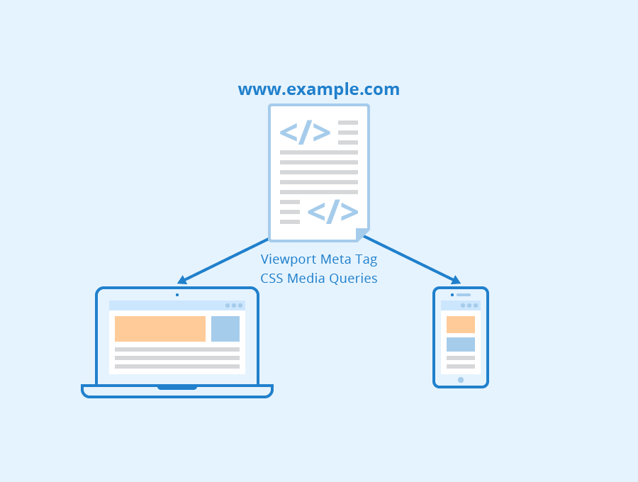
Responsive design is a technique that allows a website to adapt to different screen sizes and devices. It involves using flexible grids, images, and CSS media queries to adjust the layout of a website based on the size of the screen. Here are some best practices for implementing responsive design: Use a mobile-first approach: Design the website for mobile devices first, then scale up for larger screens.
Use a flexible grid: Use a grid system that can adjust to different screen sizes.
Use fluid images: Use images that can scale up or down based on the screen size.
Use relative units: Use relative units like em or rem instead of pixels to ensure that the website scales properly.
Media Queries
Media queries are a CSS technique that allows you to apply different styles to a website based on the size of the screen. Here are some best practices for using media queries to implement responsive web pages: Use breakpoints: Use breakpoints to define when the layout of the website should change based on the screen size.
Use the viewport meta tag: Use the viewport meta tag to ensure that the website scales properly on mobile devices.
Use CSS preprocessors: Use CSS preprocessors like Sass or Less to make writing media queries easier.
Performance Optimization
Optimizing the performance of responsive web pages is crucial for SEO and user experience. Here are some best practices for optimizing the performance of responsive web pages: Optimize images: Use compressed images to reduce the file size and improve page load times.
Minimize HTTP requests: Reduce the number of HTTP requests by combining CSS and JavaScript files.
Use a content delivery network (CDN): Use a CDN to deliver content faster to users around the world.
Use caching: Use caching to store frequently accessed files on the user's device to improve page load times.
By following these best practices, website owners and developers can ensure that their website is optimized for search engines and provides a positive user experience for all visitors.
Conclusion
In today's digital age, having a website that is optimized for search engines is crucial for businesses to succeed online. Responsive web pages are an important aspect of search engine optimization (SEO) as they improve user experience and impact search engine rankings. By implementing responsive web pages on a website, businesses can ensure that their website is optimized for search engines and provides a positive user experience for all visitors. To implement responsive web pages, businesses should follow best practices such as using responsive design and media queries. Additionally, optimizing the performance of responsive web pages is important to ensure fast loading times and a positive user experience. In conclusion, website owners and developers should prioritize implementing responsive web pages on their websites to improve SEO and provide a positive user experience. By following the best practices outlined in this article, businesses can ensure that their website is optimized for search engines and provides a positive user experience for all visitors. See Also