Motion Identity: The System Behind How a Brand Moves

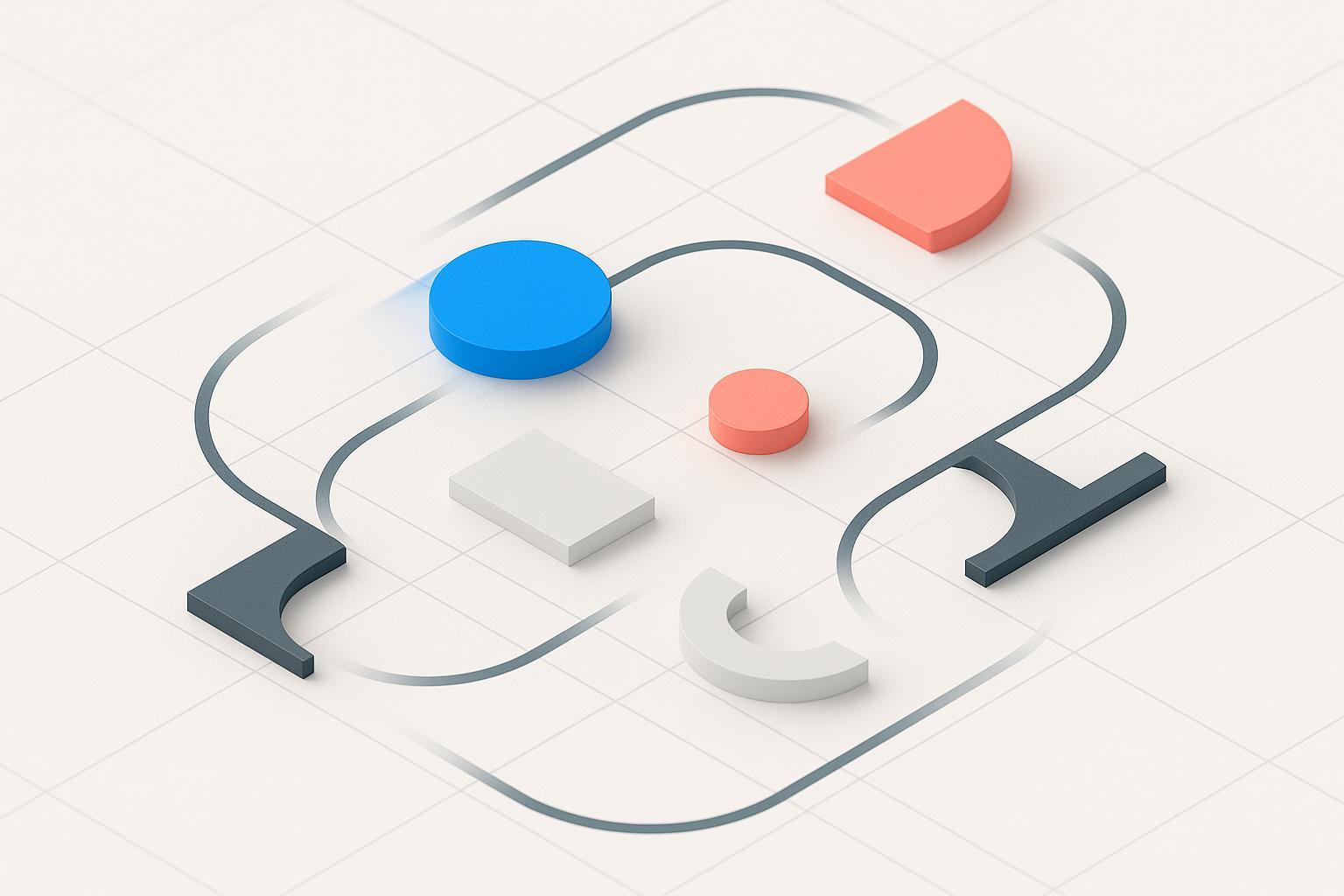
What is Motion Identity? In plain terms: it’s the codified system of movement that expresses a brand’s personality and intent across time-based media and interactive experiences. If static identity is the logo, color, and type you recognize at a glance, motion identity is the brand’s body language—its tempo, rhythm, and choreography—recognized over time.
Unlike a one-off logo animation, motion identity operates as a reusable rulebook: durations and easing curves, choreography patterns, interaction feedback, platform guidance, accessibility and performance constraints, and documentation. This system-level view aligns with how leading design systems treat motion as a purposeful language, not decoration—see Google’s guidance in the Material 3 motion overview on “how it works” (Google, 2023–2024) in the Material 3 motion overview — how it works.
Why it matters now
- Consistency across channels: Short-form video, product UI, and social stories make movement a primary brand surface. Treating motion as a system ensures coherence from app interactions to campaign spots. Apple’s Human Interface Guidelines emphasize motion that supports comfort and clarity across platforms (updated 2023–2024) in HIG — Motion.
- Better UX and comprehension: Purposeful animation can guide focus and reduce disorientation; overuse distracts. Nielsen Norman Group synthesizes these effects (2020–2023) in The role of animation and motion in UX.
- Performance and accessibility: Thoughtful motion respects user preferences (reduced motion), avoids jank, and meets web performance budgets. Google’s RAIL model targets smoothness and responsiveness (2020) in Measure performance with the RAIL model.
What a Motion Identity includes
- Personality-to-behavior mapping
- Translate brand traits (e.g., confident, playful, calm) into motion attributes (tempo, weight, elasticity, responsiveness). IBM’s Carbon Design System separates “productive” vs. “expressive” motion styles to match context (2023–2025) in Carbon — Motion overview.
- Timing system (durations, rhythm, delay)
- Establish a scale (for example: 120–200–320–480 ms for UI micro to macro), then map usage by element size/distance. Material 3 consolidates timing into spring-driven families tuned by stiffness, damping, and mass (2023–2024) in Material 3 easing and duration.
- Easing and physics library
- Define a small set: standard/eased, expressive/springy, and sharp/snappy. Microsoft’s Windows/Fluent guidance documents canonical cubic-bezier curves for entering/exiting patterns (2023–2024) in Windows — Timing and easing.
- Choreography patterns
- Name repeatable patterns: enter/exit, reveal, shared-element transitions, emphasis, and staggered sequences. Material 3’s transitions illustrate layered choreography that preserves context (2023–2024) in Material 3 transitions.
- Interaction feedback and microinteractions
- Define hover/press/release, success/error feedback, and progress/loading motion. Keep productive tasks subtle; reserve flourish for moments that matter. Carbon’s distinction between productive vs. expressive motion provides helpful guardrails (2023–2025) in Carbon — Motion overview.
- Asset system and formats
- Specify how logos, typography, illustrations, icons, and data visualizations move. Prefer vector-first delivery (Lottie/Rive/SVG) and avoid heavy raster video for UI. Practical optimization advice is summarized by LottieFiles (2023) in Speed vs. style: optimize load times without sacrificing animation design.
- Platform guidance
- Map tokens and patterns to web, iOS, Android, watchOS, and environmental screens. Apple cautions against disorienting camera moves and oscillations in HIG — Motion (2023–2024).
- Accessibility and performance constraints
- Include reduced-motion variants, file-size budgets, frame-rate targets, and composited-only property rules (transform/opacity). MDN documents the
prefers-reduced-motionmedia query (2024) in MDN — prefers-reduced-motion.
- Documentation and tokens
- Publish principles, usage rules, do/don’t examples, code snippets, and ready-to-use files. Store durations/easing as design tokens so teams can implement consistently; the Design Tokens Community Group maintains the cross-tool format specification (Editors’ Draft, 2024–2025) in Design Tokens CG — Format specification.
Motion Identity vs. Logo Animation vs. Motion Branding
- Motion Identity: The codified ruleset (principles, tokens, patterns) that defines how the brand moves across products and communications. This mirrors how systems like Material and Carbon formalize motion as a language, e.g., the Material 3 motion overview — how it works (Google, 2023–2024) and Carbon — Motion overview (IBM, 2023–2025).
- Logo Animation: A single asset or a handful of treatments (intro/outro, stings). Useful, but only one application of the system. A logo sting without system rules will not scale.
- Motion Branding: The broader practice of using motion to build recognition and meaning across touchpoints. Motion identity is the operational core—its codified rulebook—inside that practice.
How to build your Motion Identity (a practical 6‑step framework)
- Translate brand traits into motion attributes
- Example: “Confident, precise” → crisp easing, short settle times, restrained overshoot; “Playful, friendly” → bouncier springs, staggered reveals.
- Define motion tokens
- Establish a duration scale and easing families. Name them like you name color/type tokens (e.g., duration-100/200/320/480; easing-standard, easing-emphasized, spring-medium). Map to platform curves such as Windows’ entering/exiting cubic-beziers in Windows — Timing and easing (2023–2024) or Material spring presets in Material 3 easing and duration (2023–2024).
- Create choreography patterns and component behaviors
- Define navigation transitions, modal entrances, card reveals, list reorders, loaders, and logo stingers. Document directions, offsets, delays, and hierarchy so teams can reproduce the “feel.” See layered transitions in Material 3 transitions (2023–2024).
- Prototype and test across key surfaces
- Build reference flows for web, app, and social video. Validate comfort, comprehension, and task speed. Nielsen Norman Group outlines evaluation criteria (2020) in Executing UX animations: duration and motion.
- Document with examples, code, and reduced-motion variants
- Provide implementable files (Lottie/Rive), CSS/JS/SVG snippets, and motion-reduced alternatives. MDN shows how to adapt with
@media (prefers-reduced-motion)(2024) in MDN — Using media queries for accessibility.
- Govern and measure
- Set review gates, version your motion library, and train agencies/partners. Measure brand recall and UX impact with A/B tests (e.g., task time, error rate, satisfaction), consistent with NN/g advice in The role of animation and motion in UX (2020).
2024–2025 best practices you shouldn’t skip
- Accessibility first: Provide a clear way to pause/stop longer moving content; WCAG 2.1 SC 2.2.2 (2018) explains these controls in WCAG 2.1 Understanding SC 2.2.2. Honor system settings with
prefers-reduced-motionand consider server hints likeSec-CH-Prefers-Reduced-Motiondocumented by MDN (2023–2024) in MDN — Sec-CH-Prefers-Reduced-Motion. - Performance budgets: Animate only transform and opacity to use the compositor; avoid layout-affecting properties that cause jank, per Google’s guidance (2024) in Avoid non-composited animations. Target smoothness and responsiveness per the RAIL model (2020) in Measure performance with the RAIL model.
- Platform-native nuance: Follow platform motion principles for comfort and predictability; Apple’s guidance summarizes common pitfalls (2023–2024) in HIG — Motion. On Windows, use documented easing families to align with ecosystem expectations in Windows — Timing and easing (2023–2024).
- Tokenize for scale: Store durations/easing as design tokens to ensure cross-tool and cross-platform consistency; align with the Design Tokens CG — Format specification (2024–2025).
- Vector-first delivery: Prefer Lottie/Rive/SVG for UI-scale motion; avoid GIFs for quality and performance. See LottieFiles’ optimization advice (2023) in Speed vs. style: optimize load times without sacrificing animation design.
Real-world examples and references to learn from
- Material Design (Google): Spring-based motion families, durations, and layered choreography, documented in the Material 3 motion overview — how it works and easing and duration (2023–2024).
- Apple HIG: Qualitative motion principles centered on comfort and clarity in HIG — Motion (2023–2024).
- Microsoft Fluent/Windows: Canonical cubic-bezier curves and navigation patterns in Windows — Timing and easing (2023–2024) and Connected animation (2023–2024).
- IBM Carbon: Two styles—productive vs. expressive—for context-sensitive motion, in Carbon — Motion overview (2023–2025).
- Klarna brand: Public motion guidelines cover principles, timing, easing, and assets in Klarna — Motion (2024–2025).
Common pitfalls (and how to avoid them)
- Over-animating everything: If every element moves, nothing stands out. Reserve expressive motion for key moments; keep routine interactions productive and subtle per Carbon’s model in Carbon — Motion overview.
- Ignoring reduced-motion users: Always provide reduced-motion variants and controls. See MDN’s guidance (2024) in MDN — prefers-reduced-motion and WCAG 2.1 SC 2.2.2 (2018) in WCAG 2.1 Understanding SC 2.2.2.
- Performance regressions: Avoid animating layout properties; adopt compositor-friendly transforms and set asset size/frame-rate budgets. Google summarizes these practices (2024) in Avoid non-composited animations.
- One-off logo stings: Without tokens and patterns, teams can’t reproduce the brand feel. Build the system first; let the logo animation be one application of it.
Quick FAQ
- Do we need a motion identity if we already have a static style guide? Yes—your static assets don’t tell teams how the brand behaves over time or in interactive contexts. Systems like Material and Carbon show why motion is a first-class language, e.g., Material 3 motion overview — how it works (2023–2024).
- How fast should animations be? Most UI transitions fall roughly in the 120–400 ms band, adjusted by element size and context; systems like Material 3 use spring parameters to adaptively tune motion (2023–2024) in Material 3 easing and duration.
- What about implementation on the web? Prefer animating transform/opacity and respect
@media (prefers-reduced-motion); MDN’s docs (2024) in MDN — Using media queries for accessibility show the pattern.
Key takeaways
- Motion identity is not “a logo animation.” It’s a reusable system—principles, tokens, and patterns—that codifies how your brand moves.
- Treat motion like color and type: define it, token‑ize it, document it, govern it.
- Build with accessibility and performance in mind from day one—honor reduced motion, animate compositor-friendly properties, and set budgets.
- Anchor decisions in platform guidance and proven design systems (Material, HIG, Fluent, Carbon) and study public brand examples like Klarna.
- Measure impact. Evaluate comprehension, task time, satisfaction, and brand recall to keep the system honest and effective.