Interactive Demos (No‑code): A Friendly Beginner’s Guide to Building One Today

If you’ve ever thought, “I’m not technical—can I really make a product demo people can click through?” this guide is for you. In 2025, buyers expect to explore on their own before talking to sales. Vendors who offer hands‑on previews see stronger engagement and better-qualified conversations, as shown in the 2024–2025 market snapshots summarized in the Navattic State of the Interactive Demo report (2024/2025).
Good news: you can create a polished, no‑code interactive demo in about 90–120 minutes. We’ll walk through what it is, how to choose a tool (without overwhelm), a step‑by‑step workflow, accessibility and privacy must‑haves (WCAG 2.2), metrics to track, and a simple 7‑day improvement plan.
What exactly is an interactive demo?
An interactive demo is a self‑guided, click‑through experience that lets someone try your product’s key steps safely—without needing a real account or a developer on standby. Think of it like a guided museum tour: there are clear stops, short explanations, and a friendly “next” button. Most no‑code tools do this by capturing screens or replicating key UI, then layering hotspots (clickable areas), tooltips (small explanations), and progress indicators.
If you want a concise definition with examples, the Userpilot beginner guide (2025) explains that demos can highlight features using tooltips, hotspots, and even branching paths—without writing code.
Where can you use these demos?
- Website landing pages (to boost engagement and conversion)
- Email campaigns or sales rooms (as a leave‑behind)
- Sales decks and webinars (as a live assist)
- Help docs and onboarding (to shorten time‑to‑value)
Don’t worry if your product is complex. Your first demo should focus on one short flow (for example, “Create a project” or “Upload a file”) that’s 8–12 steps long. You’ll expand later.
Tool choice, simplified (start with one of these)
There are many platforms, but beginners don’t need a long comparison table. Start with one of the two below. You can always switch later.
- Supademo: Fast to learn, friendly editor, AI assists for text, CTAs/forms, and branching if you need it. See a capability overview in the Supademo features page.
- Arcade: Polished embeds and flexible “Inline/Modal/Popout” display options, with straightforward website embedding documented in the Arcade embed guide.
When to consider enterprise tools later: If you need very advanced analytics, HTML-level editing with blurring/replacements at scale, or deep personalization for ABM, explore enterprise‑oriented platforms (often pricier and more complex) after you ship your first win.
Tip to avoid paralysis: Pick one tool today, build your first 10‑step demo, then evaluate whether you truly need more power.
Quick‑start workflow (90–120 minutes)
Time estimates assume you’ve already installed a demo tool’s browser extension or editor.
- Pick one small flow (10–15 minutes)
- Choose a single “aha” path: e.g., “Create a project and share it.” Aim for 8–12 steps.
- Write a one‑line promise: “In 60 seconds, see how to create and share your first project.”
- Jot a storyboard: Step 1 “Home screen,” Step 2 “Click New Project,” Step 3 “Name your project,” etc.
- Capture your steps (10–20 minutes)
- Open your product (or a staging/sandbox). Use sample data to avoid exposing real customer info.
- Hit Record in your chosen tool. Click through your storyboard slowly.
- Stop the capture. The tool generates a draft demo with steps.
- Edit and add guidance (20–30 minutes)
- Add a short headline and 1–2 sentences per step. Keep text conversational.
- Use hotspots to draw attention. Add a progress indicator if the tool supports it.
- Insert 1–2 clear CTAs: “Start free trial,” “Book a call,” or “See pricing.” Place them after the key “aha” moment and at the end.
- Brand the basics (5–10 minutes)
- Add your brand color for buttons/accents. Use accessible contrasts (more on that below).
- Upload your logo if available.
- Publish and embed (15–25 minutes)
- Publish your demo as a share link and as an embed. Most tools provide an iframe snippet.
- Paste your embed code into your CMS (e.g., WordPress HTML block, Webflow Embed).
Example generic embed snippet (replace with the code your tool provides):
<!-- Paste the embed code provided by your demo tool -->
<iframe
  src="PASTE-YOUR-EMBED-URL"
  width="100%"
  height="600"
  loading="lazy"
  frameborder="0"
  title="Interactive product demo"
  allow="fullscreen; clipboard-read; clipboard-write">
</iframe>
- For detailed embed options (inline vs modal vs popout), check the Arcade embed guide. Other tools provide similar steps.
- Quick test pass (10–15 minutes)
- Desktop: Play through, fix typos, ensure the next/back buttons are obvious.
- Mobile: Test on iOS and Android if possible; verify text size and tap targets.
- Keyboard: Press Tab/Shift+Tab through the demo; confirm focus moves logically and buttons are operable via Enter/Space.
- Ship it (5 minutes)
- Add a short intro above the embed: “Try it in under a minute—no signup.”
- Go live, then share the link with your team and first prospects.
Quick‑start checklist you can copy
- [ ] One focused flow (8–12 steps) with a one‑line promise
- [ ] Captured in a staging/sandbox using sample data
- [ ] Clear step copy and visible progress indicator
- [ ] 1–2 prominent CTAs after the “aha” moment and at the end
- [ ] Brand color applied with good contrast
- [ ] Embedded with width:100%; lazy loading for performance
- [ ] Basic tests: mobile, keyboard, and copy proofread
Copy and UX tips that make a big difference
- Keep steps short: One action per step with a single next move.
- Write microcopy like you speak: “Click Create project,” “Name it,” “Share with your team.”
- Use action‑first CTAs: “Start free trial,” “Book a 15‑min call,” “Try it now.”
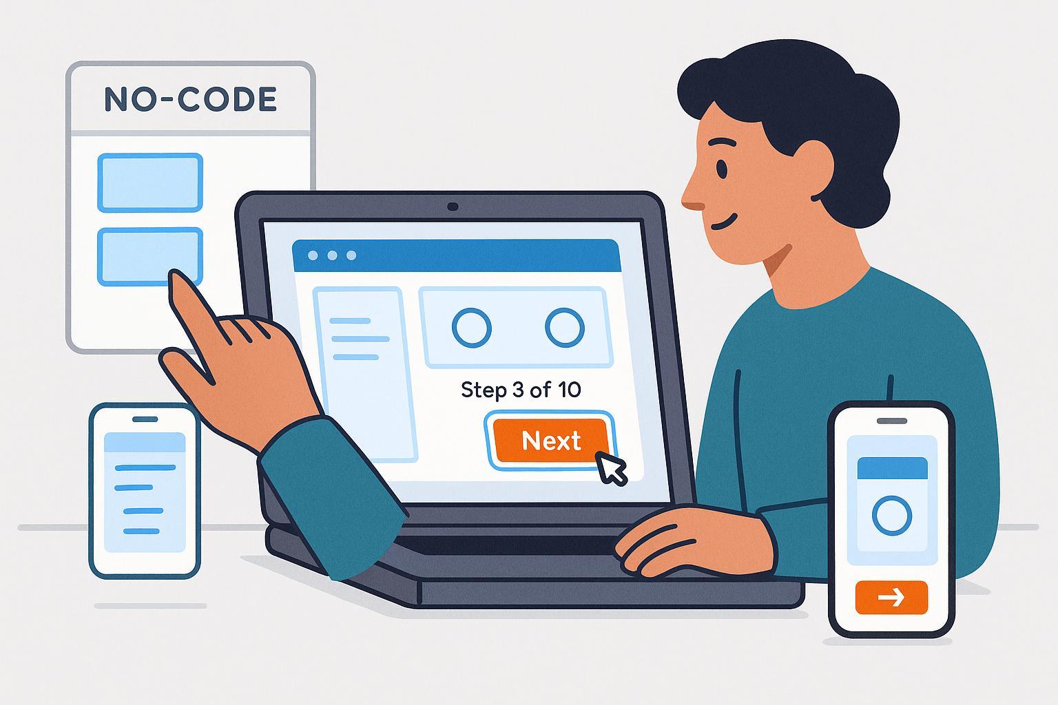
- Show progress: “Step 3 of 10” helps people commit.
- Avoid dead‑ends: Always offer a next step or a CTA.
- Trim ruthlessly: If a step doesn’t move users toward value, cut it.
Accessibility and mobile must‑haves (WCAG 2.2 basics)
You don’t need to be an expert to make your demo more inclusive. A few practical rules cover most beginner needs:
- Keyboard operable: Every interactive element (hotspots, next/back, close) should work with Tab/Shift+Tab and Enter/Space. This aligns with W3C WCAG 2.1.1 Keyboard (Understanding).
- Visible focus: When you tab, the focused element should be clearly outlined with sufficient contrast (a WCAG 2.2 update). See W3C WCAG 2.4.11 Focus Appearance (Understanding).
- Comfortable tap targets: Buttons and hotspots should be at least 24×24 CSS px (bigger is better on touch). See W3C WCAG 2.5.8 Target Size (Minimum) (Understanding).
- Contrast and clarity: Use strong text contrast for step copy and buttons; avoid light‑gray text on white backgrounds.
- No hover‑only info: If something appears on hover, make sure it also appears on focus/tap.
- Mobile checks: Avoid tiny text; keep body copy ~16 px+; test landscape and portrait. For practical mobile tips, see WebAIM’s Mobile Accessibility guide.
Small effort, big win: Add a quick “Accessibility test” to your publish routine—tab through your demo, try it on a phone, and fix anything confusing.
Privacy and data safety basics (read this before you hit Publish)
- Use sample or anonymized data in captures. Don’t record real customer PII.
- Blur or replace sensitive fields/screens if your tool allows it.
- Disclose analytics/cookies used by your embeds in your privacy policy.
- EU/UK cookie consent: If your embed sets non‑essential cookies/trackers (common for analytics), obtain valid consent before setting them. The U.K. ICO’s guidance explains the requirements in the PECR cookies overview and practical steps in How to manage consent in practice.
- Keep it optional: In early‑funnel placements, avoid hard gates; let visitors explore without handing over data first.
Analytics 101: the five numbers to watch
You don’t need a data team. Track these basics and you’ll know where to improve:
- Play rate: People who start step 1 ÷ total viewers.
- Completion rate: People who finish the last step ÷ starters.
- Drop‑off step: The step with the largest exits—often where copy is unclear or an action is hard.
- Time per step: Long time can mean interest or confusion. Pair it with drop‑off to interpret.
- CTA clicks: Percentage of engaged viewers who click a next step (book, trial, pricing).
Directional ranges: According to Navattic’s 2024–2025 benchmarks, healthy demos often show a 35–45% play rate, completion in the 40–50% range, and meaningful CTA clicks for engaged users. Treat these as guidance, not hard targets; your mileage will vary by audience and placement.
Design note: Keeping demos concise helps. An analysis of real demos suggests roughly a dozen steps can optimize completion, with visuals and “chapters” improving engagement—see the Arcade interactive demo statistics post (2024).
A simple A/B test to try next week
- Variant A: Keep your current intro slide.
- Variant B: Replace it with a punchy promise (“Try invoice creation in 60 seconds—no login”).
- Compare play rate and completion over a week; keep the winner.
Common pitfalls and quick fixes
- Too many steps: Trim to 8–15. Focus on 2–4 “aha” moments; cut detours.
- Weak or missing CTAs: Add a clear next step after the big win and at the end.
- Slow loads: Use lazy loading in the embed; avoid heavy video; compress images.
- Over‑gating: If you must gate, do it after some engagement, not before.
- Mobile pain: Make sure buttons are large enough and not crammed together; avoid hover‑only hints.
- Navigation confusion: Add a visible progress indicator and a back button.
7‑day improvement plan (copy and paste)
- Day 1: Review analytics. Identify the biggest drop‑off step.
- Day 2: Rewrite that step’s microcopy; add/clarify the hotspot; test on mobile.
- Day 3: Add or refine your main CTA with a clear value (“Start free trial—no credit card”).
- Day 4: Improve contrast and focus states; run a keyboard‑only test.
- Day 5: Shorten the demo by 1–2 steps; remove any dead‑ends.
- Day 6: Try the intro slide A/B test (promise‑based headline).
- Day 7: Ship changes and review early results; plan the next iteration.
Mini‑FAQ
Q: Do I need engineering help to start?
A: Not for your first demo. No‑code tools handle capture, hotspots, and embeds. If you later need deep data masking or complex personalization, loop in a developer.
Q: Should I gate my demo with a form?
A: For top‑of‑funnel, start ungated to maximize engagement. If you want leads, consider soft gates later (e.g., show a form after “Step 6 of 10”).
Q: How long should my first demo be?
A: Aim for 8–12 steps. If completion drops, try trimming or grouping into chapters.
Q: How do I make sure it works on mobile?
A: Test on a real phone. Use 16 px+ body text and large tap targets. Ensure any hover info is also available on tap.
Q: What’s the one thing that moves the needle most?
A: Clear value plus a clear next step. Make the “aha” moment obvious and put a prominent CTA right after it.
You’ve got this. Publish your first simple demo today, learn from a week of data, and iterate. In a month, you’ll wonder why you waited.