Building Custom Analytics Dashboards with QuickCreator


You can build custom analytics dashboards with QuickCreator using a simple 5-step process designed for beginners. QuickCreator gives you a clear path: define goals, select key metrics, integrate data, design visuals, and launch your dashboard. Many users report a 75% boost in engagement and a 15% reduction in budget errors after using these analytics dashboards. Dashboards help you spot trends, set benchmarks, and make smarter decisions with real-time data.
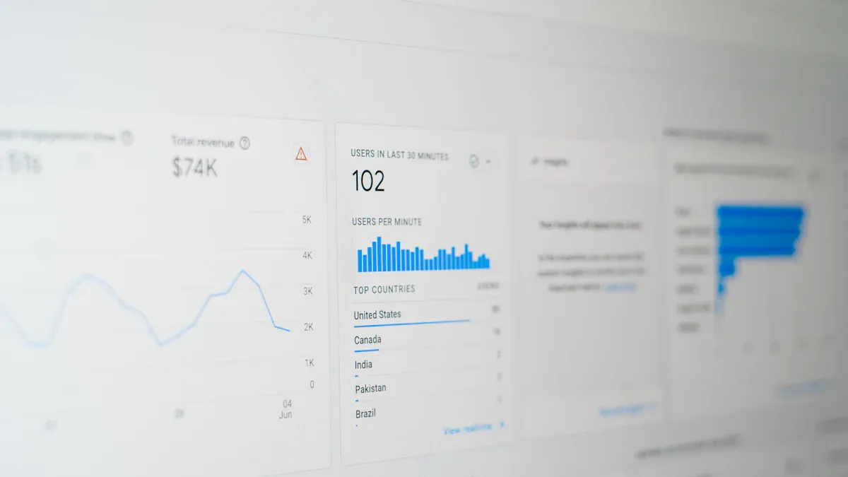
Dashboards serve as central hubs for analytics, making it easier for you to track KPIs and drive results.
Key Takeaways
QuickCreator helps you build custom analytics dashboards in five simple steps: define goals, select key metrics, gather data, design visuals, and launch your dashboard.
Choose KPIs that match your business goals and audience needs to keep your dashboard clear and focused on what matters most.
Integrate data from different sources into one dashboard to get real-time insights and make faster, smarter decisions.
Design dashboards with clear visuals and interactive features to help users understand data quickly and explore details easily.
Regularly update and share your dashboard with your team to keep data accurate, improve collaboration, and support better decision-making.
Getting Started
What Are Custom Analytics Dashboards
You use custom analytics dashboards to turn complex data into clear, actionable insights. These dashboards help you focus on the information that matters most for your goals. Each dashboard is unique because it matches your business needs and user roles. For example, a CEO might want to see total revenue and new customers, while a marketer looks for web analytics dashboard metrics like conversions and traffic sources.
Custom analytics dashboards align with your business goals and user roles.
CEOs and managers track revenue, customer growth, and costs.
Marketers and analysts focus on web analytics dashboard data, such as campaign ROI and conversion rates.
Product managers monitor user engagement and retention.
Finance teams use dashboards for budget tracking and payroll analysis.
You can design a data analytics dashboard for any department. Some dashboards track spending, others show timeclock hours, and some break down payroll by employee. You choose the metrics that solve your biggest challenges. Dashboards give you real-time analytics and help you make better decisions fast.
Tip: Always test your analytics dashboard with real users. Their feedback helps you refine the dashboard and improve usability.
Why Use QuickCreator
QuickCreator makes building an analytics dashboard simple and efficient. You save time and money because QuickCreator combines many tools into one platform. Companies report up to 40% lower content costs and faster dashboard creation.
Feature | QuickCreator Advantage |
|---|---|
Cost Savings | Up to 40% reduction |
Time Efficiency | 37% faster dashboard creation |
SEO Performance | 190% increase in organic traffic |
Multilingual Support | Global reach, consistent tone |
You get AI-powered analytics, automated SERP analysis, and keyword tracking. QuickCreator helps you discover trends and optimize your web analytics dashboard for better results. You can use free tools like Google Trends for initial research, then switch to QuickCreator for advanced analytics. This approach balances cost and functionality.
With QuickCreator, you build dashboards that deliver accurate data and actionable insights. You keep your analytics dashboard up to date and relevant for your team. User testimonials highlight the platform’s ease of use and strong support, making it a top choice for web analytics dashboard creation.
Building Custom Analytics Dashboards

Define Goals and Audience
You need to start your analytics dashboard project by setting clear goals and knowing your audience. This step shapes every decision you make later. When you define what you want to achieve, you can focus your analytics dashboard on the right questions. For example, you might want to track sales growth, improve customer retention, or monitor conversion metrics.
Understanding your audience is just as important. A CEO, a marketing manager, and a product developer all need different information from a dashboard. You should gather input from your team, review sales reports, and look at customer surveys. This helps you find out what matters most to your users.
Tip: Use interviews and surveys to collect both numbers and stories from your audience. This approach helps you build a dashboard that truly fits their needs.
A structured approach works best:
Set clear objectives for your analytics dashboard.
Identify your main audience and their needs.
Gather data from reports and surveys.
Analyze patterns and key metrics.
Share client stories or testimonials to build trust.
Sector | Type | Key Evidence Supporting Importance of Goals and Audience Understanding | |
|---|---|---|---|
Aviation & Aerospace | Electromagnetic Solutions by Leonardo | Explanatory | Clear solution and explanation tailored to the audience’s understanding. |
BFSI | Target-Date Fund Solution by JPMorgan | Explanatory | Detailed explanation with clear objectives and measurable outcomes. |
When you follow these steps, your analytics dashboard becomes more persuasive and effective. You create a dashboard mockup that matches your business goals and speaks directly to your users.
Select KPIs and Reports
After you set your goals, you need to choose the right KPIs and reports for your analytics dashboard. KPIs, or key performance indicators, help you measure progress toward your goals. Picking the right KPIs makes your dashboard useful and easy to understand.
You should avoid adding too many metrics. Focus on the ones that matter most, like conversion metrics, customer retention, or web analytics dashboard data. This keeps your dashboard clear and helps you make decisions faster.
Selecting relevant KPIs gives you real-time views of team performance.
You improve efficiency by giving teams direct access to the data they need.
Shared dashboards increase transparency and collaboration.
Real-time analytics let you spot trends and problems quickly.
You can forecast growth and prioritize important tasks.
KPI dashboards act as early warning systems. They help you find problems before they grow. You can also use dashboards to spot new business opportunities and monitor costs. Always align your KPIs with your business goals and your audience’s needs. Avoid vanity metrics that do not drive action.
Note: Tailor your analytics dashboard to your audience. Choose KPIs that answer their questions and help them reach their goals.
Gather and Integrate Data
Now you need to gather and integrate data from all your sources. This step turns your dashboard mockup into a real analytics dashboard. You might pull data from sales systems, marketing tools, or customer databases.
Custom dashboards work best when they connect all your data in one place. You can use secure APIs and database integrations to stream data into your analytics dashboard. Automation helps you collect and update data without manual work.
Use validation rules to keep your data accurate.
Standardize data formats for easy integration.
Automate data refreshes and alerts to keep your dashboard current.
Real-time integration lets you respond quickly to changes.
Use middleware and ETL tools to connect different systems.
Protect your data with encryption and role-based access.
A unified data pipeline makes your analytics dashboard reliable and fast. You can also use component libraries to speed up dashboard design and keep your dashboard mockup consistent. Involving your team early and gathering feedback helps everyone adopt the new dashboard.
Design Graphics and Widgets
The next step is dashboard design. You want your analytics dashboard to be clear, visual, and easy to use. Good dashboard design uses graphics and widgets to turn raw data into insights.
Explanation | |
|---|---|
Mobilize every element | Use each graphic to show data clearly. |
Maximize data density | Show more data in less space, but keep it readable. |
Overview and details on demand | Let users see both big trends and small details. |
Layering & Separation | Group related data and use color to reduce clutter. |
Narratives of space and time | Use visuals to tell stories about changes over time or location. |
Best Practice | Description |
|---|---|
Read left to right | Arrange your dashboard mockup for natural reading flow. |
Group related info | Place similar data together for easy scanning. |
Make it interactive | Let users filter, drill down, and explore data. |
Keep it visual | Use charts, graphs, and widgets for quick understanding. |
Easy access and use | Make your analytics dashboard available online with strong security. |
Avoid common mistakes like starting with too much complexity or using metrics no one understands. Keep your dashboard mockup simple and focused. Use interactive dashboards to let users explore data and find answers fast.
Tip: Always test your dashboard design mockup with real users. Their feedback helps you improve clarity and usability.
Remember to address data security and privacy. Use encryption and secure authentication, especially if your analytics dashboard handles sensitive data. You can also use AI-driven analytics and new technologies to make your dashboard more interactive and insightful.
Implement and Iterate
You are now ready to launch your analytics dashboard. Start by building a dashboard mockup and sharing it with your team. Use their feedback to make improvements. Iteration is key to success.
Iterative processes help you launch faster and avoid costly mistakes. You can test your analytics dashboard, fix problems early, and focus on features your users need. SaaS companies, e-commerce platforms, and marketing teams all use iterative design to improve dashboards and boost results.
Quick prototyping and feedback cycles speed up your launch.
Early testing helps you find and fix issues before they grow.
Continuous improvement keeps your analytics dashboard relevant.
Iteration lowers costs by focusing on what users really want.
Flexibility lets you adapt your dashboard to new needs and trends.
The iterative process includes planning, designing, building, testing, and repeating until your analytics dashboard is ready. You can use dashboard mockups, automation, and user feedback to refine your dashboard design. This approach works for any type of analytics dashboard, from a web analytics dashboard to a user engagement dashboard or a data analytics dashboard.
Note: Always keep your analytics dashboard up to date. Regular updates and feedback help you maintain accuracy and value.
With QuickCreator, you can build customizable dashboards, create interactive dashboards, and offer customizable views for every user. You can integrate data sources, track conversion metrics, and design a dashboard that grows with your business. Your analytics dashboard becomes a powerful tool for decision-making and success.
Optimizing Your Analytics Dashboard
Visual Clarity and Usability
You want your dashboards to deliver clear insights fast. The best dashboards use simple layouts and strong visual hierarchies. When you design an analytics dashboard, focus on essential data and remove extra chart elements. This approach reduces cognitive load and helps users spot trends quickly.
Clear visualizations help you find critical business outcomes in seconds.
Preattentive processing lets you detect outliers in your data within 250 milliseconds.
Good layout design, like using white space and grid alignment, improves legibility.
Filtering and drill-down features let you explore details only when needed.
User testing shows that cluttered dashboards slow you down. Eye-tracking studies reveal that users prefer simple layouts. You can use heatmaps and flowcharts to see where users focus. These tools help you improve your dashboard mockup and make your analytics dashboard more effective.
Automation and Real-Time Data
Automation makes your dashboards smarter. You can set up your analytics dashboard to send alerts when data changes or when it finds anomalies. Real-time data adoption helps you track lead conversion rates, sales team performance, and customer engagement.
Live dashboards pull data from many sources, like Google Analytics or IoT sensors. This gives you instant insights and helps you solve problems faster. Automation also reduces repetitive tasks, so you can focus on higher-value analysis. You improve operational efficiency and deliver actionable insights to your team.
Best Practices for Dashboards
The best dashboards start with a clear purpose. You should define your audience and choose the right KPIs for your analytics dashboard. Use data storytelling to make your insights easy to understand. Add context with time frames and comparisons.
Principle | Explanation |
|---|---|
Consider your audience | Tailor complexity and data presentation to user needs. |
Determine your goals | Focus on key questions and relevant data. |
Choose relevant KPIs | Align metrics with goals and audience. |
Tell a story with your data | Use visualizations to communicate insights clearly. |
Provide context | Add labels and comparisons for actionable insights. |
You should test your dashboards early and often. Use both qualitative and quantitative feedback to refine your dashboard mockup. Customization and regular updates keep your analytics dashboard relevant. The best dashboards use data visualization to turn raw data into actionable insights and support better decisions.
Sharing and Maintaining Dashboards
Deploy and Share
You can deploy your analytics dashboard quickly and share it with your team for better collaboration. When you share dashboards, everyone works from the same data and gains access to real-time analytics. This approach helps you spot trends and make decisions faster. Many companies use dashboards to improve their operations:
Walmart tracks inventory and supply chain data, reducing stockouts and costs.
IBM uses dashboards for HR analytics, cutting dashboard development costs by 25%.
Delta Air Lines monitors customer service metrics, improving satisfaction and lowering expenses.
Siemens manages project timelines and budgets, preventing overruns.
Microsoft uses dashboards to monitor IT systems, catching issues early.
Procter & Gamble tracks product development, reducing time-to-market by 40%.
You can use features like semantic models and dataflows to unify data from different sources. Template apps and workspaces let you package and distribute dashboards easily. Comments and chat tools help your team discuss analytics and share insights in real time. Security features keep your data safe while you collaborate.
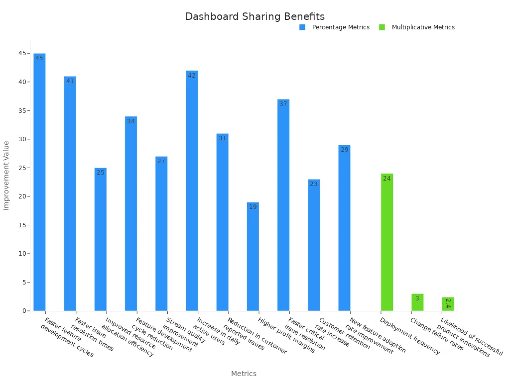
Sharing dashboards increases efficiency, improves resource allocation, and helps teams resolve issues up to 41% faster.
Maintain and Update
You need to keep your analytics dashboard accurate and up to date. Regular maintenance ensures your data stays relevant and your analytics provide reliable insights. You should review your dashboard policies often and update them when you add new equipment or change processes. Use digital tools to automate scheduling and track compliance. Real-time monitoring helps you detect problems early and keep your data current.
Schedule periodic reviews and assign responsibility for updates.
Use version control to avoid outdated data.
Train your team on the importance of accurate documentation.
Conduct audits and feedback sessions to find and fix gaps.
These steps help you maintain compliance, improve safety, and manage risks. When you update your analytics dashboard regularly, you support better decision-making and keep your team informed.
Single Web Analytics Dashboard
A single web analytics dashboard gives you a unified view of your website’s performance. You can track key metrics in one place, making it easier to spot trends and take action. Here are some important metrics you can monitor:
Sessions: Total visits to your website.
Users: Unique visitors who access your site.
Pageviews: Number of pages viewed.
Bounce Rate: Percentage of visitors who leave after one page.
Average Session Duration: Time spent per visit.
Conversion Rate: Percentage of visitors who complete a desired action.
Benefit Category | Description | Numerical Metrics / Data Examples |
|---|---|---|
See all marketing data together for a complete picture. | ROI, Customer Journey Insights | |
Real-Time Data Reporting | Get instant access to current analytics for quick decisions. | Sessions, Users, Pageviews |
Advanced Data Visualization | Turn complex data into easy-to-read charts and maps. | Graphs, Heatmaps, Geo-mapping |
Automated Reporting | Schedule reports and validate data automatically. | Scheduled reports, Data validation checks |
Key Metrics to Track | Focus on the most important analytics for your business. | Website Traffic, Conversion Rates, Customer Acquisition Cost, ROI |
Integration of Data Sources | Combine CRM, social media, and sales data for deeper insights. | CRM data, Social media engagement, Sales revenue |
Customizable Dashboards | Adjust your dashboard layout and data to fit your needs. | Widgets, Filters, Alerts |
You gain better visibility, faster reporting, and more actionable insights with a single web analytics dashboard. This unified approach saves time and helps you make smarter choices for your business.
You gain many advantages when you build your dashboard with QuickCreator.
You see real-time data and make quick business changes.
You focus on the right metrics for your role, which helps you make better choices.
Automation saves time and reduces mistakes in data reporting.
Your dashboard grows with your needs and keeps your team working together.
Apply these steps and best practices to create an analytics dashboard that supports your goals. Start building your dashboard today and unlock the power of your data.
FAQ
How do you choose the right KPIs for your analytics dashboard?
You start by defining your business goals. Then, select KPIs that match those goals. Focus on metrics that give actionable insights. Avoid adding too many. The best dashboards highlight only the most important data for your team.
Can you integrate data sources from different platforms into a single web analytics dashboard?
Yes, you can integrate data sources from many platforms. Use secure APIs or connectors. This approach creates a unified view. A single web analytics dashboard helps you see all your analytics in one place and improves decision-making.
What makes dashboard design effective for custom analytics dashboards?
Effective dashboard design uses clear visualizations and logical layouts. You should group related data. Use interactive dashboards for deeper exploration. A dashboard mockup helps you test ideas before launch. Good design leads to better data insights.
How often should you update your data analytics dashboard?
You should update your data analytics dashboard regularly. Schedule reviews weekly or monthly. Real-time data and live dashboards keep your analytics current. Frequent updates ensure your dashboard provides accurate and actionable insights.
Can you customize dashboards for different users or teams?
You can create customizable dashboards with customizable views for each user or team. Customization lets you show only relevant data. This approach increases user engagement and helps everyone focus on their own conversion metrics and goals.
See Also
Comparing Writesonic AI And QuickCreator For Content Creation
How To Boost Audience Engagement Using TikTok Data Tools
Step-By-Step Guide To Quick Creator’s New Content Features
Complete Guide To AI Blog Builder For Hosting And SEO
Easy Beginner’s Guide To Building An Effective Keyword Matrix