The Ultimate Guide to Mobile Optimization for Healthcare SEO: Best Practices for Mobile-Friendly Content and Responsive Design
Importance of Mobile-Friendly Content
In today's digital age, it is imperative for healthcare professionals and website owners to recognize the importance of mobile-friendly content. With more than 60% of internet searches conducted on mobile devices, having a responsive design that delivers optimal user experience across all devices has become essential in order to remain competitive. The healthcare industry is no exception to this trend as patients increasingly rely on their smartphones and tablets for medical information and services. Why Mobile Optimization is Important for Healthcare SEO
Mobile optimization plays a crucial role in improving search engine rankings and increasing online visibility. In fact, Google has made it clear that mobile-friendliness is a major factor in determining a website's ranking on its search engine results pages (SERPs). This means that if your healthcare website isn't optimized for mobile users, you may be losing potential patients to competitors who have invested in creating a seamless mobile experience.
In addition to enhancing your SEO efforts, optimizing your website for mobile can also boost engagement with patients by making it easier for them to find the information they need quickly. Patients are often looking for quick answers when searching health-related topics on their phones or tablets while on-the-go. If your website cannot provide the necessary information easily and efficiently via these devices, they will likely look elsewhere. Creating Mobile-Friendly Content
Creating high-quality content that is easily accessible across all devices requires careful planning and execution. One approach involves implementing responsive web design principles which allows websites to adapt their layout based on screen size without sacrificing functionality or visual appeal.
Another important aspect of creating effective mobile-friendly content is ensuring that text remains legible even when viewed on smaller screens. This means using appropriate font sizes – typically around 16px – as well as spacing between lines so text doesn't appear too cramped or difficult to read.
Healthcare professionals should also consider incorporating multimedia elements such as images or videos into their content strategy where appropriate; however care should be taken not overload pages with too much multimedia as this can slow down page load times and negatively impact the user experience.
Real-world examples of healthcare websites that have successfully implemented mobile optimization include Mayo Clinic and WebMD. Both websites utilize responsive web design to deliver a seamless experience across all devices, while also incorporating engaging multimedia elements that are optimized for fast loading times. Use of Responsive Design
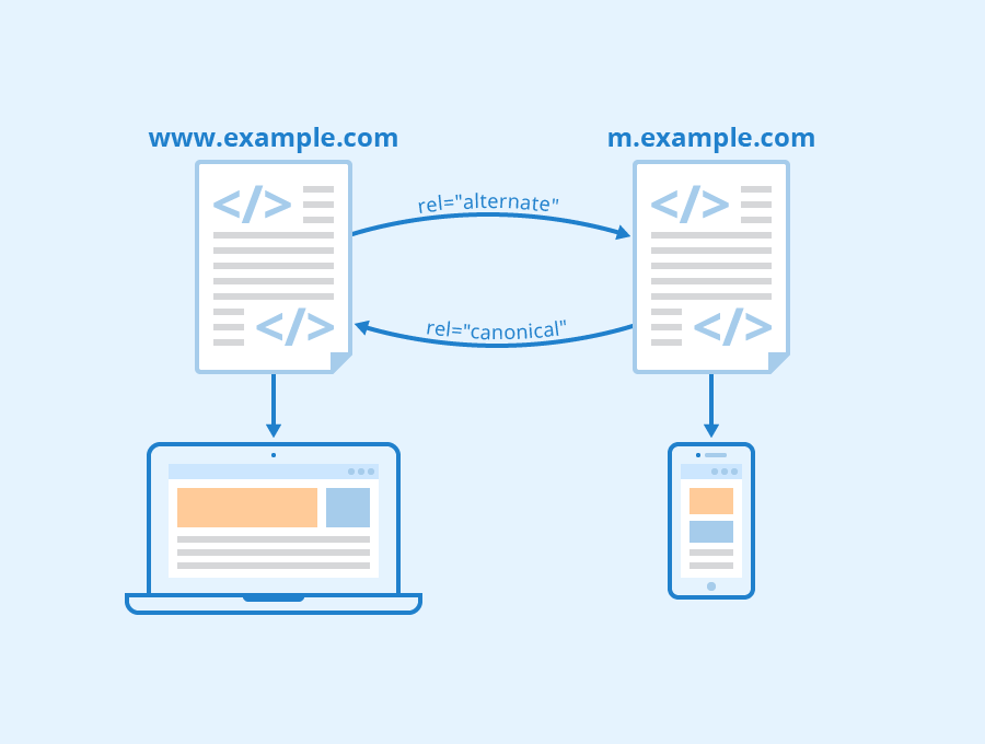
What is Responsive Design and Why is it Important?
Responsive design refers to the ability of a website to adapt its layout and content based on the device used by the user. This means that whether someone visits a healthcare website from their desktop computer, tablet or mobile phone, they will have an optimal viewing experience without having to zoom in or out. Importantly, responsive design ensures that healthcare websites remain accessible and easy to navigate for all users regardless of their preferred method of access. In today's digital age where more than half of all internet traffic comes from mobile devices (Statista), this has become increasingly important for healthcare professionals looking to improve patient engagement and satisfaction. Implementing Responsive Design for Healthcare Websites
Implementing responsive design can be a challenging process but it is one that offers significant benefits when done correctly. By improving user experience on both desktop and mobile devices, responsive design can help boost search engine rankings which are crucial for attracting new patients.
Fortunately, there are several real-world examples of healthcare websites that have successfully implemented responsive design such as Mayo Clinic (mayoclinic.org) which features a clean layout with easy-to-read text and images no matter what device is being used. Similarly, Cleveland Clinic (my.clevelandclinic.org) utilizes simple navigation menus along with bold headlines while also ensuring fast load times. Statistics show just how important responsive design is becoming in today's digital world: For example, according to Google Mobile-First Indexing resource page "More than 50% of searches globally now come from mobile devices" while BrightEdge reports reveal "Mobile accounts for over half (57%) web traffic worldwide". These statistics demonstrate why implementing this practice cannot be ignored if you want your healthcare website ranking high in search engines like Google.
To implement responsive design effectively requires some actionable tips:
Ensure your website uses fluid layouts so elements adjust automatically based on screen size.
Use clear fonts with legible text sizes to ensure readability on all devices.
Optimize images for fast loading times across all devices.
Test your website using various mobile devices and screen sizes to identify any issues that need fixing.
By implementing these tips, healthcare professionals can provide a better digital experience for their patients while also improving their search engine rankings.
Finally, responsive design is essential because it improves patient engagement and satisfaction. Patients expect a seamless experience when interacting with healthcare providers online, which includes accessing information quickly and easily from any device. By offering an accessible and user-friendly platform through responsive design, healthcare professionals can improve patient satisfaction levels as well as boost the chances of retaining current patients in the long term.
Optimization of Website Speed and Performance
Why Website Speed and Performance is Important for Healthcare SEO
In today's fast-paced world, nobody likes to wait around for a slow-loading website. Research shows that visitors will abandon a website if it takes more than three seconds to load. This is particularly true when it comes to healthcare websites, where patients expect quick access to information about their health concerns.
Fast loading speed on mobile devices has become increasingly important in recent years because of the rise of mobile search traffic. In fact, Google now uses mobile-first indexing as its primary method of crawling and ranking websites. This means that a website's performance on mobile devices plays an even greater role in its overall search engine rankings.
Furthermore, improving website speed and performance can lead to higher patient engagement and satisfaction rates. A study by Google found that 53% of users are likely to leave a page if it takes longer than three seconds to load. Patients who experience slow loading times may become frustrated or confused, leading them to seek care elsewhere. Improving Website Speed and Performance for Mobile Users
There are many ways healthcare professionals and website owners can optimize their site's speed and performance for mobile users:
1) Use optimized images: Large image files can significantly slow down your site's loading time. Optimize all images before uploading them onto your site by compressing the file size without compromising quality.
2) Minimize HTTP requests: Each element on your web page requires an HTTP request, which slows down the page load time. Reduce these requests by combining multiple style sheets into one file or minimizing the number of scripts used on each page.
3) Enable browser caching: Caching allows frequently accessed files (like logos or CSS stylesheets) to be stored locally so they don't have to be reloaded every time someone visits your site from the same device/browser combination.
4) Consider using Content Delivery Networks (CDNs): CDNs store copies of static content like images, videos, and other media on servers worldwide, reducing the distance between your website's server and user's device.
5) Use a responsive design: Responsive designs adjust to fit any screen size, optimizing the viewing experience for mobile users. This means that all content (including images and videos) will load quickly no matter what device is being used. Many healthcare websites have successfully optimized their speed and performance for mobile users. For example, Mayo Clinic has a fast-loading site with an average page load time of 2.8 seconds on mobile devices. They achieved this by minimizing HTTP requests, using optimized images, enabling browser caching, and implementing a responsive design.
Impact of Mobile Optimization on Healthcare SEO
Benefits of Mobile Optimization for Healthcare SEO
The benefits of mobile optimization for healthcare websites are numerous. Firstly, having a mobile-friendly website improves user experience and reduces bounce rates. Google's algorithm takes into account the amount of time users spend on your website as well as how many pages they visit during that time when ranking sites in search results. A high bounce rate indicates to Google that users are not finding what they need on your site and this can negatively impact your rankings.
Secondly, according to recent studies, over 60% of internet searches now take place on mobile devices. This means that if you do not have a mobile-optimized site, you may be missing out on potential patients who are searching for healthcare services from their smartphones or tablets.
Thirdly, having a responsive design ensures that your content is displayed correctly across all screen sizes. This is important because different devices have varying screen resolutions and aspect ratios which can affect the layout of your website. Measuring the Effectiveness of Mobile Optimization for Healthcare Websites
One way to measure the effectiveness of mobile optimization efforts is by tracking changes in organic search traffic from mobile devices using tools like Google Analytics. By comparing data before and after implementing changes such as improving page speed or optimizing content for smaller screens, website owners can see whether these efforts have resulted in increased traffic from mobile devices.
Another metric to track is engagement metrics such as click-through rates (CTR) and conversion rates (CR). If there has been an increase in CTRs or CRs since implementing changes related to mobile optimization then this could indicate improved user experience resulting from better optimized content.
Finally, it's also important to monitor patient feedback regarding the usability and accessibility of the site via surveys or social media channels The goal should be creating an engaging online presence with good communication strategies with existing patients while attracting new ones through effective digital marketing practices.
Real-world examples demonstrate how successful implementation impacts a healthcare organization’s bottom line. A case study by Geonetric shows that a healthcare system saw a 50% increase in mobile traffic after optimizing their website for mobile devices, which resulted in an overall increase of 25% more web registrations and appointment requests from patients. Similarly, Trinity Health reported a 54% increase in the number of visits to its site on mobile devices after implementing responsive design. A survey conducted by Google found that over two-thirds of patients use smartphones or tablets to look up information related to their health issues. This indicates that having a mobile-friendly website can significantly improve patient engagement and satisfaction with the healthcare provider's online presence. Overall, it is clear that mobile optimization is crucial for healthcare SEO as more users turn towards their smartphones and tablets to search for healthcare services online. By following best practices for creating mobile-friendly content and designing responsive websites, healthcare professionals can improve user experience resulting in better rankings, increased traffic, enhanced patient engagement, and ultimately higher revenue streams. Conclusion
In today's mobile-first world, optimizing your healthcare website for mobile is crucial. With the majority of patients using mobile devices to search for healthcare information, it's important for healthcare professionals and website owners to ensure their website is mobile-friendly and has a responsive design. By following best practices for mobile optimization, such as creating mobile-friendly content and implementing responsive design, you can improve your healthcare SEO and reach more patients online. Remember to prioritize user experience and make your website easy to navigate on any device. By doing so, you'll not only improve your website's search engine rankings, but you'll also provide a better experience for your patients. See Also