Optimizing Your eCommerce Site for Mobile: Responsive Design, Navigation, and Search
Introduction
In today's world, an increasing number of people are accessing the internet through their mobile devices. As a result, it is crucial for online store owners and managers to ensure that their eCommerce site is optimized for mobile users. Unfortunately, many sites are still using inefficient website structures that do not translate well to smaller screens. This can lead to frustrated users who may abandon the site altogether and seek out competitors with more user-friendly designs. Therefore, it has become imperative for businesses to have a mobile-friendly site in order to remain competitive and retain customers. In this blog post, we will explore various strategies for optimizing your eCommerce site for mobile including responsive design, navigation, and search functionality. By implementing these tactics on your own site, you can improve user experience and ultimately increase conversions. Responsive Design
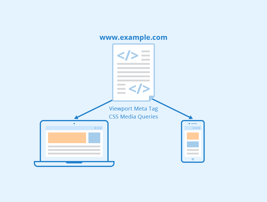
One of the most crucial aspects of optimizing an eCommerce site for mobile is responsive design. Responsive design refers to a website's ability to adapt and adjust its layout based on the device accessing it, ensuring that the user experience remains consistent across all platforms. This means that regardless of whether a customer accesses your site from a desktop computer, tablet or smartphone, they will be able to navigate through your pages with ease. One significant benefit of using responsive design for eCommerce sites is increased conversion rates. A well-designed responsive website loads faster and provides an optimal browsing experience compared to non-responsive websites. Customers are more likely to make purchases when they can easily access product information and checkout seamlessly without experiencing any technical difficulties due to incompatible screen sizes.
Another advantage of having a responsive website is improved search engine rankings. Google has stated that responsiveness is one factor in determining how high up a website appears in search results pages (SERPs) since users tend to abandon webpages that take too long or have poor navigation experiences on their devices.
Responsive design also helps online store owners save time and money by reducing maintenance costs as there’s no need for separate desktop/mobile versions; everything can be managed within one platform which makes updates more efficient and streamlined than maintaining different versions separately.
Overall, implementing responsive design into your eCommerce site ensures accessibility across multiple platforms while enhancing user engagement, improving SEO performance, increasing conversion rates and saving time/money in the long run – making it essential for every online store owner who wants their business thrive in today's digital world where mobile devices are becoming increasingly popular among consumers.
Mobile Navigation
Mobile devices have become the primary means of accessing the internet, and this trend shows no signs of slowing down. As an eCommerce site owner or manager, it is crucial to optimize your website for mobile users. A significant aspect of mobile optimization is designing clear and concise navigation that enables users to find what they are looking for quickly. The importance of clear and concise mobile navigation cannot be overstated. The Importance of Clear and Concise Mobile Navigation
Mobile screens are small, which makes it challenging to design effective navigation menus that fit within limited space without compromising usability. However, providing poor mobile navigation can result in a frustrating user experience that leads to lost sales or abandoned carts. Clear and concise mobile navigation helps users easily navigate through your online store's pages without getting lost or frustrated. It also ensures that customers can access essential information such as contact details, shipping policies, returns policy, etc., with ease. Effective mobile navigation provides a seamless experience across all devices and platforms while maintaining consistency with desktop experiences.
Tips for Effective Mobile Navigation Design
Designing effective mobile navigation requires careful consideration to ensure optimal user experience on smaller screens. Here are some tips for creating efficient mobile navigations:
1) Use Hamburger Menus:
Hamburger menus are three horizontal lines placed at the top left or right corner of a screen indicating hidden content behind it when clicked upon by a user. This design pattern saves valuable screen real estate while allowing you to provide easy access to essential pages such as "Home," "Shop," "Cart," "My Account," etc.
2) Keep It Simple:
Simplicity is key in designing effective mobile navigations; too much complexity will only confuse users leading them away from making purchases from your online store.
Keep menu items simple yet descriptive enough so that visitors can understand what they mean without second-guessing. Avoid using too many links in the menu, and make sure they are organized and easy to scan.
3) Use Descriptive Labels:
Make sure your navigation labels accurately reflect what visitors will find when they click on them. Using vague or misleading labels will only confuse users, leading to a poor user experience.
Use descriptive language that is clear and concise so that visitors can easily understand where each link leads them.
4) Utilize Search Bar:
A search bar is an essential element of mobile navigation design as it allows users to quickly find products or information without having to navigate through multiple pages.
Place the search bar at the top of your website's homepage for maximum visibility and use autocomplete features for faster results.
Optimizing for Mobile Search
In today's world, mobile devices have become an integral part of our lives. As a result, more and more consumers are using their smartphones to browse and make purchases online. According to Statista, in 2021 alone, 73% of eCommerce sales will be made on mobile devices globally. Therefore it is essential for eCommerce sites to optimize their search functionality for mobile users.
The Importance of Mobile Search Optimization
Mobile search optimization plays a vital role in the success of any eCommerce site because it ensures that potential customers can find what they are looking for quickly and efficiently. If your website is not optimized for mobile search, it could lead to poor user experience resulting in lower conversions rates and high bounce rates. Moreover, Google now uses mobile-friendliness as one of its ranking factors; hence optimizing your site for mobile searches can improve your SEO ranking. Tips for Optimizing eCommerce Sites for Mobile Search
Here are some tips that online store owners and managers should consider when optimizing their eCommerce sites for mobile search:
Implement Responsive Design
One way to optimize your website design is by implementing responsive design principles. A responsive design ensures that your site looks great on all screen sizes regardless if users access them from desktop or smartphone browsers. It also helps reduce loading times by only displaying necessary elements based on the device used. Optimize Site Navigation
Ensure easy navigation throughout the entire website with clear menus and categories so visitors can easily find what they’re looking for while browsing through products or pages without feeling overwhelmed or frustrated due to complicated layouts or hidden links/features within sections/pages themselves (i.e., hidden behind images). An intuitive menu system allows shoppers quick access from anywhere within the framework without needing extensive scrolling/searching techniques required when using non-responsive/non-mobile-friendly designs/layouts.
Use Relevant Keywords
Use relevant keywords throughout all content pieces such as product descriptions , meta tags including title tag & description tag which help google bots understand what your site is about and help connect it with the right queries. However, do not stuff keywords as this could trigger Google's spam algorithm.
Optimize Site Speed
Speed optimization should be a top priority for eCommerce sites because slow loading times can lead to high bounce rates. According to Google, 53% of mobile users abandon websites that take longer than three seconds to load. Therefore, optimizing your website speed is crucial in reducing bounce rate and increasing conversion rates.
Conclusion
In today's digital age, having a mobile-friendly site structure is essential for eCommerce sites. With the majority of online shoppers now using their mobile devices to make purchases, it's crucial that your website is optimized for this platform. By implementing responsive design, intuitive navigation and search functionality, you can ensure that your customers have a seamless experience on your site regardless of what device they're using. To compete in the highly competitive world of eCommerce, it's important to stay ahead of the curve and provide an exceptional user experience across all platforms. Some eCommerce sites that have effectively implemented mobile-friendly site structures include Amazon, Sephora and Target. By taking action now to optimize your own eCommerce site for mobile users, you'll be able to increase traffic and boost conversions while staying relevant in an ever-evolving market. Don't miss out on potential sales - optimize your site today! 