The Power of Mobile Optimization: Boosting Healthcare Website Conversions
Introduction
<strong>The Power of Mobile Optimization: Boosting Healthcare Website Conversions</strong>
In today's digital age, mobile devices have become an integral part of our daily lives. According to recent surveys, over 80% of internet users own a smartphone and use it to browse the web. The healthcare industry is no exception and has seen significant growth in mobile usage for healthcare-related searches. Patients are increasingly turning to their smartphones and tablets to search for medical information, book appointments with doctors, access patient portals, and even consult with physicians remotely. As a result, healthcare professionals and website owners need to prioritize mobile optimization if they want to improve user experience and boost conversions on their websites. In this blog post, we will discuss why mobile optimization is crucial for healthcare websites and how it can help increase conversions for businesses in the healthcare industry.
Benefits of Mobile Optimization
As the world becomes increasingly mobile-centric, optimizing your healthcare website for mobile has never been more important. Mobile optimization involves tailoring your website to fit on smaller screens and creating a seamless user experience across all devices. In this section, we will explore the benefits of mobile optimization in improving user experience and increasing conversion rates. Improved User Experience
Optimizing your healthcare website for mobile can greatly improve the overall user experience. When users visit a site that is not optimized for their device, they may encounter issues such as slow loading times or difficult-to-read text. This can lead to frustration and ultimately result in potential patients leaving your site before finding what they need.
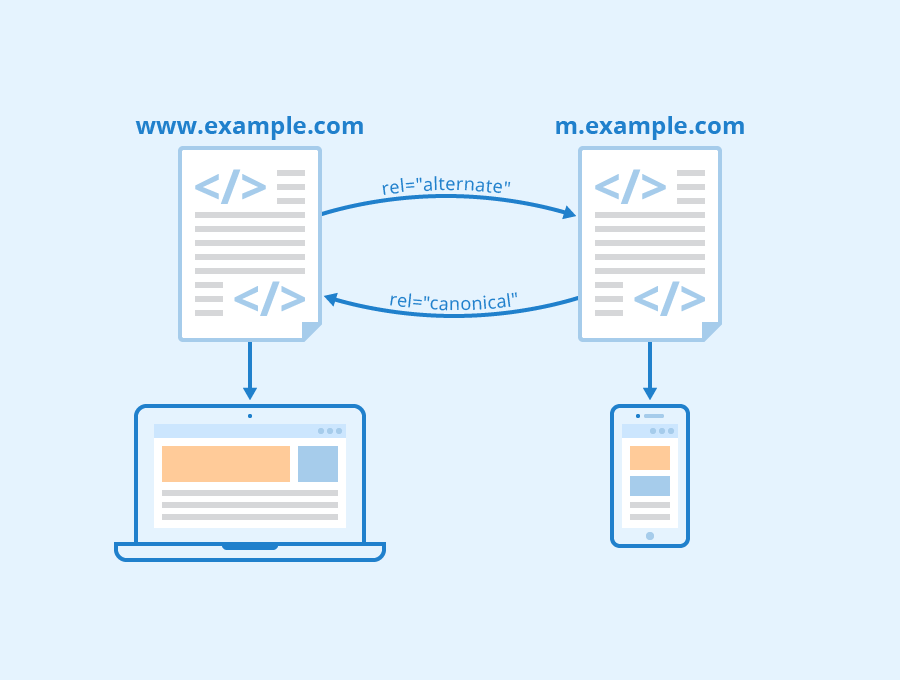
By implementing responsive design techniques, you can create a website that automatically adjusts to fit any screen size while still maintaining its functionality and aesthetics. With responsive design, users will have a positive viewing experience no matter which device they are using to access your site.
Increased Conversion Rates
In addition to improving user experience, mobile optimization can also increase conversion rates on your healthcare website. When visitors have a positive browsing experience on their mobile devices, they are more likely to stay engaged with your content and take action by scheduling an appointment or making contact through phone calls or emails.
Studies show that websites with fast load times have higher conversion rates than those with slower speeds. By optimizing images and reducing code bloat, you can ensure that your pages load quickly on both desktops and smartphones alike – leading to increased engagement from potential patients.
Mobile-Responsive Design
Mobile-responsive design is one of the most critical aspects of ensuring effective mobile optimization for healthcare websites. With responsive design techniques applied correctly during web development process , Your health care business could become accessible from every kind of device used by customers nowadays like phones tablets laptops etc.. Responsive Design means creating websites in such way that it works perfectly fine in different sizes screens without compromising UI/UX (User Interaction/User Experience). A primary benefit of mobile-responsive design is that it allows your website to adapt to the screen size of any device. This means that whether a user is accessing your site from their smartphone or desktop, they will have an optimal viewing experience.
Faster Loading Times
Mobile users are often on-the-go and require quick access to information. Slow loading times can cause frustration and lead potential patients to leave your healthcare website before taking action.
By optimizing images and reducing code bloat, you can ensure that your pages load quickly on both desktops and smartphones alike – leading to increased engagement from potential patients. Additionally, utilizing caching techniques like browser caching could reduce latency in content delivery for returning visitors who may already have some parts of the page saved in their cache memory which makes them able to see more faster than non-returning users.
Easy-to-Use Navigation
Creating easy-to-use navigation is crucial when designing a mobile-friendly healthcare website. Users should be able to easily find what they need without having to click through multiple menus or scroll excessively.
To optimize navigation for mobile devices, consider implementing a hamburger menu – a three-lined icon that opens up into a list of options when clicked – as well as incorporating clear calls-to-action (CTAs) throughout the site. CTAs like "Call Now" or "Schedule an Appointment," make it simple for users on the go with limited time so they could perform action right away instead of browsing around the whole web page looking where they could interact with health care business services offered by you. Tips for Optimizing Content for Mobile Devices
In today's digital age, it is essential to optimize website content for mobile devices as more and more users access the internet through their smartphones. This is especially important in the healthcare industry where patients rely on online resources to find information about health conditions, treatments, and medical professionals. To ensure that your healthcare website converts visitors into patients, here are some tips for optimizing content for mobile devices.
1. Simplify Navigation
Mobile screens are smaller than desktop monitors which means that navigation menus need to be clear and concise so that users can easily find what they're looking for without having to scroll endlessly. Use simple language and limit menu options to six or seven items at most.
2. Use Responsive Design
Responsive design ensures that your website adapts to different screen sizes by using fluid grids, flexible images, and CSS media queries. By implementing responsive design on your healthcare website you can provide a seamless user experience across all devices whether it be a smartphone or tablet.
3. Optimize Images
Images often take up a lot of space on web pages which can slow down load times on mobile devices resulting in impatient users bouncing off your site before even seeing its contents. To prevent this from happening compress images using tools like TinyPNG or JPEGmini.
4. Keep Content Short and Sweet
Long blocks of text are daunting enough when viewed on desktops let alone smartphones where reading long paragraphs becomes an arduous task due to small screen sizes limiting attention spans further still! Therefore it's crucial you keep content short while still conveying the necessary message clearly with bullet points being ideal format suited best for such cases!
Conclusion
In conclusion, mobile optimization is critical for any healthcare website that wants to boost conversions. With the majority of internet users accessing websites through their mobile devices, it is imperative that healthcare professionals and website owners make sure their sites are fully optimized for mobile use. By doing so, they can improve the user experience, increase engagement with visitors, and ultimately drive more leads and sales. Mobile optimization also helps enhance a website's credibility and authority in the eyes of search engines like Google, which can lead to higher rankings and increased traffic over time. Therefore, if you want your healthcare website to succeed in today's digital landscape, investing in mobile optimization should be at the top of your priority list.
See Also