The Power of Mobile Optimization: Boosting eCommerce ROI
Introduction
As eCommerce continues to grow, with global sales expected to reach $4.9 trillion by 2021, it has become increasingly important for businesses to optimize their websites for mobile devices. The impact of mobile optimization on eCommerce ROI cannot be overstated – studies have shown that a majority of online shoppers now use their smartphones or tablets to make purchases, and those who encounter a poorly optimized website are much more likely to abandon their shopping carts and take their business elsewhere. Mobile Optimization: What Is It?
Mobile optimization involves designing your website so that it is easily accessible and navigable on smaller screens such as smartphones and tablets. This includes using responsive design techniques which automatically adjust the layout of your site depending on the screen size being used. Additionally, mobile-optimized sites typically feature simplified navigation menus, larger text sizes and images, faster load times, and other features designed specifically for mobile users. The Importance of Mobile Optimization
As mentioned earlier in this article introduction section, there has been a significant shift in recent years towards consumers using their smartphones or tablets to shop online – in fact, according to Statista.com data published in Q2 2019 over half (54%) of all eCommerce transactions were made via smartphone devices. Failing to provide these users with an optimized experience can result in lost sales - research shows that almost three-quarters (73%) of online shoppers will switch from one brand or retailer if they find another with a better mobile experience. Additionally beyond just losing revenue because potential customers couldn't complete orders due poor user experiences when browsing from phones or tablet computers; search engine algorithms also factor into ranking results based off how well-aligned sites are across different platforms like desktops vs laptops versus iPhones/iPads/Android devices etc., hence another reason why optimizing website content accordingly becomes critical for driving traffic back onto pages too!
With all these factors considered together we can see how vital having an optimised site really is nowadays. It's no longer just about ensuring that your website looks good on desktop computers, but also across the variety of screen sizes consumers may use. In order to maximize eCommerce ROI, it’s imperative for businesses to invest in mobile optimization and stay ahead of the curve in this ever-evolving digital landscape.
Benefits of Mobile Optimization for eCommerce ROI
In today’s digital age, mobile optimization is essential for eCommerce businesses to increase their online visibility and reach a wider audience. Mobile devices have become the primary means of accessing the internet, with over 50% of all website traffic coming from mobile devices. In this section, we will explore how mobile optimization can benefit eCommerce businesses by increasing mobile traffic and conversions, leading to higher ROI. Increased Mobile Traffic
Mobile optimization can significantly increase the amount of traffic an eCommerce site receives from mobile users. By optimizing your website for mobile devices, you are making it easier for users to access your site on-the-go and browse through products or services they might be interested in purchasing. This increased accessibility translates into more clicks on your site resulting in more potential customers. One way to optimize for increased traffic is by implementing responsive design that adapts seamlessly across different screen sizes without losing functionality or visual appeal. Another effective method is creating AMP (Accelerated Mobile Pages) versions of product pages which load faster than regular web pages. Higher Mobile Conversions
Not only does optimized websites lead to increased traffic but also higher conversion rates among visitors who come via a phone or tablet device when compared with desktop visitors converting at lower rates due mainly because they're likely not prioritizing shopping during work hours! A streamlined checkout process on a responsive website encourages customers' purchase decisions as there's less friction between browsing and payment stages while offering multiple payment methods such as Apple Pay and PayPal make it easy for them complete transactions quickly.
Moreover, setting up dedicated landing pages specifically designed for campaigns targeting smartphone users could help boost conversions further since those would feature content tailored around shoppers using smaller screens along with CTA buttons positioned prominently based upon common usage patterns like scrolling down instead clicking away after arriving at page.
Improved User Experience
Optimizing an eCommerce store helps provide better user experience regardless if someone browses through items listed under different categories or looking up specific products directly using search bar. A website that loads quickly and smoothly, with easy-to-navigate menus, clear product descriptions and images along with a seamless checkout process all contribute to the user experience.
When it comes to mobile optimization for eCommerce stores here are some best practices recommended by experts:
Use large font sizes to improve readability on smaller screens
Avoid using pop-ups or interstitials as they can be frustrating for users trying to navigate your site.
Optimize images and media files for faster loading times.
Make sure buttons are easily clickable on touchscreens.
Lower Bounce Rates
A high bounce rate indicates visitors leave a website soon after arriving there without performing any actions such as clicking through different pages or adding items into shopping carts. This could either be because the content isn't relevant or accessible enough based upon where they came from (e.g., mobile search results) which is why optimizing an eCommerce store helps lower bounce rates due improved user experience factors mentioned above.
Tips for Optimizing an eCommerce Site for Mobile
As mobile usage continues to rise, it's crucial for eCommerce businesses to optimize their sites for mobile devices. Here are some actionable tips for optimizing an eCommerce site for mobile: Use Responsive Design
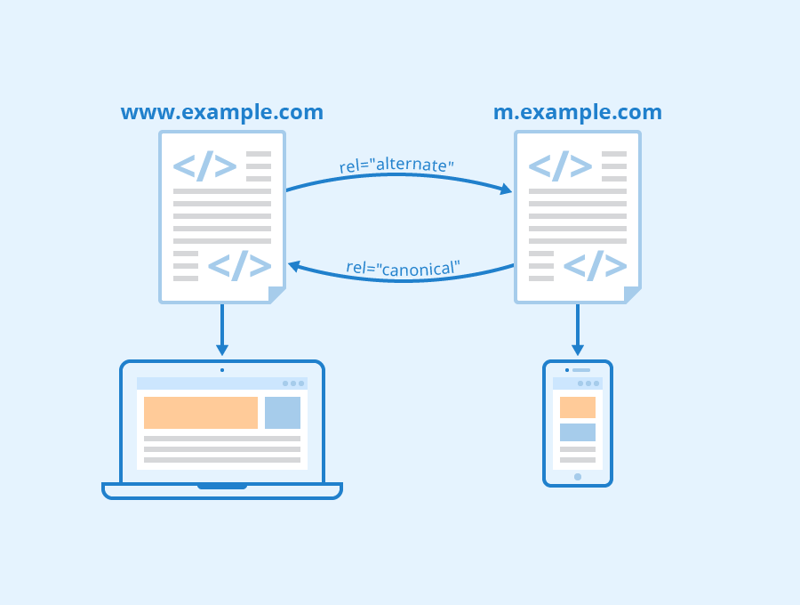
One of the most important things you can do to optimize your eCommerce site for mobile is to use responsive design. This means that your website will automatically adjust its layout based on the screen size of the device being used. With a responsive design, users won't have to zoom in or out or scroll left and right just to view content properly. Responsive design also makes it easier for search engines like Google to crawl and index your site. Without responsive design, you may end up with two separate versions of your website - one desktop version and one mobile version - which could lead to issues with duplicate content and poor SEO.
Simplify the Checkout Process
One common issue with many eCommerce sites is a complicated checkout process. On desktops, this might not be as big of an issue since users have larger screens and more precise mouse movements. However, on mobile devices where screens are smaller and touch-based navigation can be less accurate, a complex checkout process can lead to frustration and cart abandonment.
To simplify the checkout process on your eCommerce site, consider implementing features such as guest checkout options (so users don't have to create an account), auto-filling fields whenever possible, reducing the number of form fields required at checkout (such as removing unnecessary address fields), providing clear error messages if something goes wrong during checkout, etc.
Optimize Page Load Speeds
Page load speed is another important factor when it comes optimizing an eCommerce site for mobile devices. Users expect websites they visit on their phones or tablets to load quickly; according to research by Google, 53% of visitors will abandon a page if it takes longer than three seconds to load.
To improve page load speeds on your eCommerce site:
Optimize images: Large image files can slow down page load times. Compress your images to reduce their file size without sacrificing quality.
Minimize HTTP requests: Every time a user loads a webpage, their device has to make an HTTP request for each element on the page (images, stylesheets, scripts, etc). The more requests there are, the longer it takes for the page to load. Try to minimize these requests whenever possible.
Use caching: Caching can help speed up your site by storing frequently accessed data in memory or on disk so that it doesn't need to be retrieved from the server every time someone visits your site.
By implementing responsive design techniques and simplifying checkout processes while optimizing page loading speeds will benefit eCommerce business owners by boosting sales revenue and enhancing customer satisfaction with minimal bounce rates.
Conclusion
In conclusion, mobile optimization is no longer just an option - it's a necessity for eCommerce businesses looking to boost their ROI. With more and more consumers using their mobile devices to shop online, failing to optimize your website for mobile users can lead to missed sales opportunities and lower conversion rates. By prioritizing mobile optimization, eCommerce businesses can improve the user experience, increase engagement and ultimately drive higher revenue. So if you haven't already done so, now is the time to make sure that your website is fully optimized for mobile devices in order to stay competitive in today's digital landscape. 