The Power of Mobile-Friendly Design for Real Estate SEO: Boost Your Rankings Today
The Growing Importance of Mobile Traffic
The increasing prevalence of mobile devices has led to a significant shift in the way people consume online content. In recent years, mobile traffic has surpassed desktop traffic and now accounts for more than half of all internet traffic worldwide. According to Statista, as of 2021, global mobile internet user penetration was 53.3 percent and is expected to reach 61.2 percent by 2025.
This trend towards mobile usage has had a profound impact on search engine rankings, with Google and other search engines prioritizing sites that are optimized for mobile devices. This means that if your website isn't designed with mobile users in mind, you may be missing out on valuable opportunities to reach potential customers.
The Impact of Mobile-Friendly Design on Search Engine Rankings
Google's algorithms have evolved over time to place greater emphasis on providing an optimal user experience across all devices - including smartphones and tablets. As such, having a responsive or adaptive design that ensures your site looks great and functions seamlessly on any device can significantly improve your search engine rankings.
In fact, Google officially announced back in 2015 that it would begin using mobile-friendliness as a ranking signal in its algorithm updates - meaning non-mobile-friendly sites would likely see their rankings drop over time.
Moreover, according to HubSpot research report published in June 2020 found that "More than half (57%) of web visitors won’t recommend businesses with poor website designs."
Prioritizing Mobile-Friendly Sites
Search engines prioritize websites with excellent user experiences across multiple platforms - especially those optimized for smaller screens like smartphones or tablets since most searches happen through these devices. This focus reflects the reality that consumers demand fast-loading pages regardless of the device they're using at any given moment.
Therefore it is essential for real estate website owners and digital marketers who want their websites ranked highly by search engines should ensure their sites are fully optimized for use on both desktops/laptops/tabs and mobile devices.
Optimizing for Mobile Traffic
Real estate website owners and digital marketers should prioritize a responsive or adaptive design approach to ensure their sites are optimized for all devices. Here are some tips on how to optimize your site for mobile traffic:
1. Use a Responsive Design
A responsive design ensures that your website automatically adapts to the screen size of the device being used, providing an optimal viewing experience without requiring users to zoom in or out. 2. Optimize Your Images
Images can slow down your site's loading speed - particularly on mobile devices where network speeds may be slower than desktops/laptops/tabs. To improve load times, compress images as much as possible without sacrificing quality.
3. Improve Page Speed
Mobile users expect fast-loading pages, so it's essential to keep page speed top-of-mind when optimizing for mobile traffic. Consider reducing image file sizes, minifying CSS/JavaScript files, and enabling browser caching to help speed up load times.
Creating a Mobile-Friendly Website
In today's world, where most people use their smartphones and tablets to browse the internet, having a mobile-friendly website is crucial for any business. This is particularly true in the real estate industry, where potential buyers are often searching for properties on-the-go. In this section, we will provide tips for designing a mobile-friendly website that will not only improve user experience but also boost your rankings on search engines.
The Importance of Responsive Design
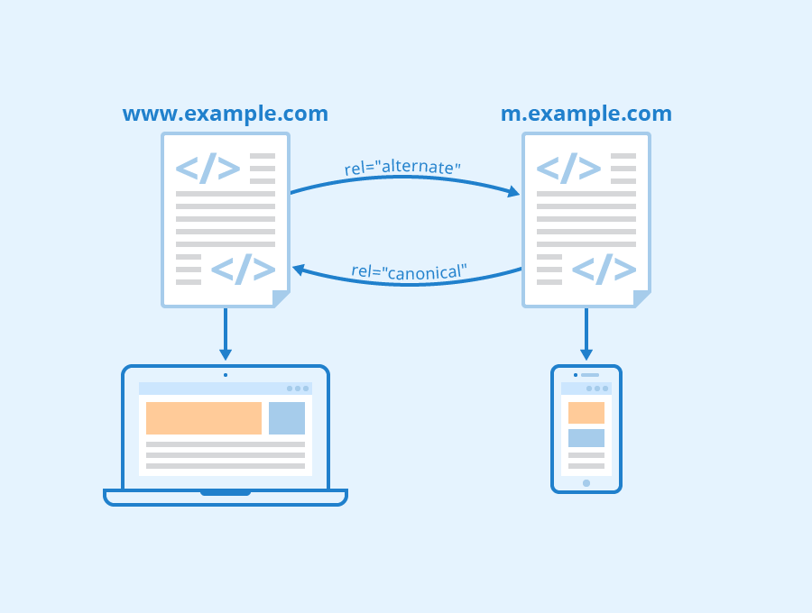
Responsive design refers to creating a website that adapts to different screen sizes and devices. It allows users to access the same content regardless of whether they're using a desktop computer or a smartphone. Responsive design is essential because it ensures that your website looks good and functions correctly across all devices. From an SEO perspective, responsive design can have a significant impact on your rankings because it helps you avoid duplicate content issues. When you have separate websites for desktop and mobile devices, Google has to crawl both sites separately, which can lead to confusion about which version of the site should be indexed. By using responsive design instead, you ensure that there is only one version of your site for Google to crawl and index.
Implementing responsive design requires careful planning when it comes to layout and content placement. You need to ensure that everything fits within smaller screens without sacrificing functionality or aesthetics.
Here are some tips for implementing responsive design:
Use flexible grids: Instead of fixed-width layouts, use grids with relative proportions so that elements can adjust based on screen size.
Prioritize important content: Make sure critical information appears at the top of each page since users may not scroll down as much on small screens.
Use clear calls-to-action (CTAs): Ensure CTAs stand out by making them larger than other elements while still fitting within smaller screens.
Minimize clutter: Reduce visual noise by eliminating unnecessary images or text blocks.
Optimizing Images for Mobile Devices
Images play an essential role in real estate websites, but they can also slow down your site's load time if not optimized correctly. Slow load times are particularly problematic on mobile devices since users may have limited data plans or poor internet connections.
Compress images: Use image compression tools to reduce file sizes without sacrificing quality.
Resize images: Only upload images that are the appropriate size for the space where you want to display them. Avoid using large files and then resizing them with HTML or CSS code.
Use a content delivery network (CDN): CDNs store copies of your website's files in multiple locations worldwide, making it faster to access resources from servers closer to users.
By optimizing your images, you can improve both site speed and user experience.
Creating User-Friendly Mobile Navigation
Mobile navigation should be intuitive and easy-to-use so that visitors can find what they're looking for quickly. Poorly designed navigation is frustrating and may cause visitors to leave your site before finding what they need.
Here are some tips for creating user-friendly mobile navigation:
Keep it simple: Limit the number of menu items visible at once, use clear labels, and group related links together.
Make it accessible: Ensure buttons are big enough to tap on small screens, avoid using dropdown menus when possible since they require precise tapping, and provide search functionality.
Prioritize important pages: Place essential pages such as "About Us" or "Contact Us" links front-and-center.
Mobile navigation affects both UX and SEO by providing an efficient way for visitors to navigate through your site while also helping search engines understand how content is organized.
Optimizing Content for Mobile Devices
When designing a mobile-friendly website, content optimization is crucial because smaller screens mean less real estate available. Therefore every word counts.
Here are some tips for optimizing content for mobile devices:
Keep paragraphs short: Long blocks of text make reading difficult on smaller screens. Instead, use short paragraphs that are easy to read.
Use headings and subheadings: Headings help break up text into easily digestible chunks while also making it easier for search engines to understand content hierarchy.
Be concise: Use clear and direct language without unnecessary fluff.
Make sure font sizes are readable on small screens.
Optimizing your content for mobile devices not only improves user experience but can also improve SEO by ensuring that search engines understand what your site is about.
Optimizing Site Speed
Site speed is critical when designing a mobile-friendly website since users expect pages to load quickly on their devices. Slow page load times can lead to increased bounce rates and decreased conversions.
Here are some tips for optimizing site speed:
Minimize HTTP requests: Reduce the number of requests needed to load the page by minimizing images, scripts, and stylesheets.
Enable caching: Caching stores data so that returning visitors don't need to reload the entire page each time they visit.
Compress files: Compressed files reduce file size without sacrificing quality, improving load times.
Use a responsive hosting provider with fast servers.
By optimizing site speed, you can ensure visitors have an excellent browsing experience while also positively impacting your SEO rankings.
Testing Mobile-Friendliness
Testing your website's mobile-friendliness is essential as it ensures optimal user engagement across different devices. Google offers several tools such as Google Search Console's Mobile Usability Report or Test My Site tool which provides insights into how well a website performs on different types of smartphone devices.
Here are some tips for testing mobile-friendliness:
Check loading speeds
Test navigation functionality
Ensure forms work correctly
Check image rendering in different screen sizes
Measuring the Impact of Mobile-Friendly Design
As we've discussed, having a mobile-friendly website is crucial for real estate SEO. But how do you measure the impact of mobile-friendly design on your rankings and traffic? Luckily, there are several tools available to help you with this task. Provide Tools for Measuring Mobile-Friendliness
Firstly, Google's Mobile-Friendly Test is an excellent tool that allows you to see if your website meets their mobile-friendliness criteria. This free tool analyzes any URL and reports back whether or not the page has a responsive design and other elements that make it easy to use on a smartphone screen. Another useful tool is GTmetrix. It provides detailed information about your website's overall performance, including mobile optimization. The report generated by GTmetrix includes recommendations for improving load times and making your site more user-friendly on all devices.
Explain How to Analyze Mobile Traffic Data
Once you've optimized your site for mobile users, it's essential to analyze the data regularly so that adjustments can be made as needed. Google Analytics offers valuable insights into how visitors interact with your site across different devices.
To evaluate your site's performance in terms of its ability to attract organic traffic from search engines like Google or Bing via smartphones or tablets, navigate through 'Audience' -> 'Mobile' -> 'Overview.' You will now have data related to bounce rate (the percentage of visitors who leave after viewing only one page), average session duration (how long each visitor spends on-site), pages per session (the number of pages viewed during an average visit) & many more which helps in analyzing what’s working well and where there’s room for improvement.
Provide Tips for Making Adjustments Based on Mobile Traffic Data
It may be necessary to adjust certain aspects of the website based on this analysis. For example, if most visitors coming from smartphones tend to spend less time browsing than those using desktops/laptops - consider revising content to make it more mobile-friendly. Similarly, if the bounce rate is high on pages that are not optimized for mobile devices, then consider redesigning those pages.
Conclusion
In today's digital world, having a mobile-friendly design is crucial for real estate SEO. As we have discussed throughout this article, mobile devices are becoming the primary means by which potential clients search for properties. Therefore, it is imperative that your website and all of its content be accessible on any device and optimized for speed and usability. By implementing the tips provided in this blog post, you can ensure that your website will rank higher in search results, attract more traffic to your site, and ultimately generate more leads. In addition to these benefits, a mobile-friendly design also enhances user experience and builds trust with clients.
Don't miss out on the opportunity to boost your rankings today - take action now to optimize your website for mobile devices!
See Also