The Power of Mobile-First Design: Boosting eCommerce UX and SEO
Introduction to Mobile-First Design
In today's digital era, mobile devices have become a primary source of browsing the internet. According to Statista, in 2021, there are approximately 3.8 billion smartphone users worldwide. With such staggering numbers, it is crucial for eCommerce businesses to optimize their websites for mobile devices. This is where mobile-first design comes into play. What is Mobile-First Design?
Mobile-first design refers to designing a website primarily for smaller screens and then scaling up to larger ones like tablets or desktops. In other words, when designing a website with a mobile-first approach, developers prioritize the experience of users on smartphones and then work towards enhancing the user experience (UX) on bigger screens. The Relevance of Mobile-First Design in eCommerce
As more people access the internet through their smartphones than ever before, having an optimized mobile eCommerce site has become increasingly critical for businesses today. A report by Google suggests that 61% of users leave websites if they cannot find what they're looking for immediately; hence it becomes imperative that eCommerce sites load quickly and offer easy navigation across all screen sizes.
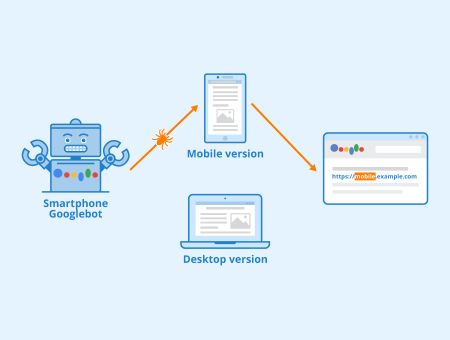
Additionally, search engines like Google now utilize mobile indexing as their primary method of crawling web pages instead of traditional desktop searches. This means that if your site isn't optimized for mobile devices - you may be missing out on higher rankings in search results pages (SERPs). Therefore incorporating a mobile-first design approach can not only improve your UX but also enhance your SEO efforts.
Successful Implementations
Several brands have successfully implemented this strategy into their online stores resulting in higher conversion rates and better customer retention rates. For example:
Amazon launched its "mobile-only deals" section which offers exclusive discounts to customers who shop from their phones.
Walmart introduced an innovative feature called 'Scan & Go,' which allows shoppers to scan items using their phone camera while shopping at physical stores.
Airbnb revamped its entire user interface with large fonts, easy-to-read icons, and clean layouts, making it easier for users to book accommodation through their mobile devices.
These successful implementations demonstrate how optimizing the user experience on mobile devices can lead to increased sales and customer satisfaction.
Improved User Experience
Mobile-first design can greatly enhance the user experience on eCommerce sites. With more and more consumers using their mobile devices to shop online, it is crucial for businesses to optimize their website design for mobile use. By prioritizing the needs of mobile users, businesses can improve overall user experience and increase engagement with their brand. Mobile Optimization Best Practices
To optimize your mobile design and enhance user experience on eCommerce sites, consider implementing these best practices: Simplify navigation: Make it easy for users to find what they need by simplifying your site's navigation menu. Use clear headings and subheadings that are easy to read on a small screen.
Example: ASOS.com has a simple hamburger icon that expands into a dropdown menu when clicked.
Optimize images: Large images can slow down page load times on mobile devices. Optimize your images by compressing them without losing quality.
Example: Sephora.com optimizes product images so they load quickly even on slower internet connections.
Use responsive typography: Ensure that your font sizes adjust automatically based on the size of the screen being used.
Example: Target.com uses responsive typography to ensure legibility across all device types.
Implement touch-friendly buttons: Make sure any clickable elements are large enough for fingers to easily tap them without accidentally clicking other links nearby.
Example: Nike.com has large call-to-action buttons prominently displayed throughout its site.
By following these best practices, you can create an optimized mobile-first design that enhances the user's shopping experience while also improving SEO rankings through better site performance.
Responsive Design vs Mobile-First Design
Responsive design aims to make web pages look good across all devices - desktops, tablets, and smartphones - by resizing elements based on screen size. Mobile-first design takes this approach one step further by considering how content will look specifically on smaller screens first before expanding outwards towards larger screens.
While both approaches have their benefits, mobile-first design is becoming increasingly important in today's digital landscape. With more users accessing websites on their phones than ever before, businesses need to prioritize the mobile experience first and foremost.
A successful implementation of mobile-first design can be seen in the redesign of The Guardian's website. By focusing on the needs of its mobile users, the site saw a 60% increase in page views per visit and a 40% reduction in bounce rate.
Case Studies
Several examples exist of successful eCommerce sites that have implemented mobile-first designs:
Airbnb: To accommodate for its global user base, Airbnb designed a single responsive website with consistent branding across all devices.
Results: The company saw an impressive 800% growth rate between 2009-2014 thanks to its optimized mobile site.
Walmart: In 2016, Walmart redesigned its app to improve navigation and search functionality while also implementing touch-friendly buttons.
Results: As a result, Walmart saw an increase in conversions by up to 20%.
Starbucks: In addition to adding features like card scanning and store locator tools into their app design, Starbucks prioritized creating an intuitive user experience with minimal clicks required.
Results: This focus on simplicity increased orders made through the app by over $1 billion annually.
By prioritizing user experience through a mobile-first approach, these companies were able to achieve significant improvements both in terms of engagement metrics as well as revenue growth.
Higher Search Engine Rankings
As eCommerce businesses continue to shift towards mobile-first design, it is important to understand how this approach can improve search engine rankings and visibility. By prioritizing the mobile user experience, online stores can attract more traffic and increase their chances of appearing at the top of search engine results pages (SERPs). In this section, we will explore how mobile-first design can improve search engine rankings for eCommerce sites. Mobile Optimization for SEO
Optimizing your website for mobile devices is essential if you want to rank well on search engines. Here are some best practices for mobile optimization that can help improve your SERP performance:
Responsive Design: Make sure your website is fully responsive so that it adjusts seamlessly across different screen sizes and resolutions. This ensures a consistent user experience regardless of the device being used. Page Speed: Optimize your site's loading speed by compressing images, minifying code, and reducing server response time. Faster page speeds not only improve SEO but also enhance user engagement.
Keyword Research: Conduct thorough keyword research to identify relevant terms that people use when searching on their smartphones or tablets. Incorporate these keywords into your content in a natural way to boost visibility.
Mobile-Friendly Content: Ensure that all text-based content on your site is easily readable without requiring users to zoom in or scroll horizontally/vertically excessively.
Meta Descriptions & Titles: Write compelling meta descriptions and titles that accurately reflect what each page contains while encouraging click-throughs from potential shoppers
Successful implementations of these best practices include The Home Depot whose responsive web design resulted in higher organic traffic after Google announced its update focused on favouring websites with fast-loading capabilities; another good example is ASOS who implemented an AMP (Accelerated Mobile Pages) version resulting in faster load times as well as improved organic visibility which led to an increase in mobile traffic. Mobile-Friendly Website Benefits
Having a mobile-friendly website is key to improving search engine rankings. Here are some benefits of adopting this approach:
Improved User Experience: Users are more likely to engage with your site if it's easy to navigate on their mobile devices, leading to lower bounce rates and longer session durations.
Increased Organic Traffic: Google rewards sites that provide a great user experience across all devices by ranking them higher in organic search results.
Higher Conversion Rates: When users have a positive shopping experience on your site, they're more likely to make purchases which can lead to higher conversion rates overall.
Data shows that implementing a responsive design can improve conversion rates by 20% or more compared with non-responsive alternatives. Additionally, according to Google, 61% of users who don't find what they're looking for on one device will try again from another device making the importance of having a mobile-friendly website undeniable. Case Studies
There are several examples of successful eCommerce sites that have implemented effective mobile-first designs resulting in improved search engine rankings:
1) Zulily - After moving towards AMP pages and reducing page load times Zulily saw an increase in organic traffic by over 50%. 2) The Iconic - The Australian-based fashion retailer implemented Progressive Web Apps (PWAs), resulting in faster load times and allowing offline browsing capabilities which led them seeing double-digit growth YoY since its implementation. 3) Montblanc – Montblanc’s redesign resulted in increased accessibility as well as boosted engagement; with their engagement rate increasing nearly fivefold following the launch of their new site. These case studies demonstrate that mobile-first design can have a significant impact on an eCommerce site's search engine rankings. By optimizing for mobile, online retailers can improve user experience and increase organic traffic leading to higher conversion rates.
Tips for Implementing Mobile-First Design
As eCommerce continues to shift towards mobile devices, implementing a mobile-first design has become essential for optimizing user experience and improving SEO. Here are some tips for eCommerce site owners and managers looking to implement mobile-first design: Step-by-Step Guide
Implementing mobile-first design involves restructuring your website's layout and content hierarchy with the goal of creating a seamless experience on smaller screens. Here is a step-by-step guide for implementing mobile-first design on your eCommerce site:
Evaluate Your Current Site: Conduct an audit of your current website to identify areas that need improvement, such as slow loading times or confusing navigation.
Develop User Personas: Create personas based on typical users who visit your site through mobile devices, including their needs, pain points, and goals.
Prioritize Content: Determine which content elements are most important for each page and prioritize them according to relevance.
Simplify Navigation: Streamline your navigation menu by eliminating unnecessary pages or subcategories that can cause confusion.
Design Flexibility: Use flexible layouts like grids that adapt easily across different screen sizes without losing functionality or visual appeal.
Optimize Images: Compress images so they load quickly while maintaining quality; use responsive images optimized based on device size.
Minimize Load Times & Interstitials (Pop-ups): Speed up load times by minimizing interstitial ads/pop-ups - these can be particularly frustrating when viewed from small screens making it difficult to access the desired information quickly.
8.Testing & Iteration Process : It’s critical during implementation process testing should be done in every phase this will help you understand whether things are working fine or not before launching it live.. By following these steps, you can create a cohesive user experience across all devices while prioritizing the unique needs of mobile users. Testing and Iteration
Testing and iteration are crucial components of successful implementation because they allow you to refine designs until they meet user needs. Here are some best practices for testing and iteration:
Conduct User Testing: Test your mobile-first design with real users to gain insights into pain points and areas that need improvement.
Use Data Analytics Tools: Use tools such as Google Analytics to determine which pages or elements of the site are most frequently accessed by users on mobile devices.
A/B Testing: Create variations of specific pages or elements, then test them against each other to identify the version that performs better according to metrics like click-through rates.
Continuous Improvement : Continuously improve based on feedback whether from customer support/feedback channels, social media platforms etc.,
By incorporating regular testing and iteration, you can ensure that your mobile-first design is optimized for both user experience and SEO.
Responsive Design Best Practices
Responsive design is an essential component of a successful mobile-first design implementation because it enables websites to adapt seamlessly across all device types while maintaining optimal functionality and visual appeal.Here are some best practices for responsive design: Optimize Images & Videos: Compress images so they load quickly on small screens without sacrificing quality; use responsive videos optimized based on device type.
Prioritize Content Hierarchy: Emphasize important content first where possible - this will help keep visitors engaged instead of forcing them top scroll down through irrelevant information before reaching what matters most..
3 .Use Clear Typography : Choose fonts carefully so they're easily readable from smaller screens without causing eye strain or frustration..
4.Ensure Consistency Across Devices : Ensure consistency in appearance, layout, font sizes etc., regardless of screen size .
By implementing these best practices in combination with a step-by-step approach and continuous testing/iteration process , e-commerce owners can create a successful mobile-first website that provides their customers with seamless experiences no matter what device they’re using..
Conclusion
In conclusion, mobile-first design is an essential element for eCommerce sites. It not only provides a better user experience for customers using mobile devices but also boosts SEO rankings. As the number of people who use their smartphones to shop online increases, it is crucial for eCommerce business owners and managers to consider implementing mobile-first design on their websites. By doing so, they can improve the overall performance of their site and increase sales conversions. In today's competitive market, having a responsive website that caters to all users' needs is vital in staying ahead of the competition. Therefore, embracing mobile-first design should be a top priority for any eCommerce business looking to succeed in the digital world. 