Maximizing eCommerce Success: The Vital Role of Navigation Structure
Introduction
In the world of eCommerce, a clear and consistent navigation structure is vital to achieving success. As an eCommerce website owner or manager, you want your customers to find what they are looking for quickly and easily. Without a well-organized navigation system, your website can become confusing and frustrating for users, leading to high bounce rates and lost sales. In fact, studies have shown that poor navigation is one of the main reasons why users abandon their shopping carts before completing a purchase. Therefore, it's essential that you pay close attention to your website's navigation structure in order to maximize its potential for success. This article will explore why having an effective navigation system matters in eCommerce and provide tips on how to create a clear and consistent structure that will help drive sales for your business. Why a clear and consistent navigation structure is crucial for eCommerce sites
In the world of eCommerce, providing a seamless user experience is key to success. One often-overlooked aspect of achieving this goal is having a clear and consistent navigation structure. This means that visitors can easily find what they are looking for without getting lost or frustrated. The benefits of having such a structure are numerous, including improved user experience, increased conversions, and better search engine optimization. Improved User Experience
A well-designed navigation structure makes it easy for visitors to find exactly what they need on your site. By grouping similar products or services together and using intuitive labels for menus and buttons, you reduce confusion and frustration among your users. This in turn leads to longer sessions on your site as users are more likely to stick around when they aren't struggling to navigate.
In addition to improving overall satisfaction with your site, an effective navigation system also helps users complete their desired action more efficiently. For example, if someone wants to purchase a specific product but has trouble finding it due to poor organization or labeling within the menu options, they may give up altogether rather than continue searching through confusing pages.
Increased Conversions
Having clear calls-to-action (CTAs) throughout your website can be one of the most important factors in driving conversions. However, even if you have amazing CTAs placed strategically throughout the page content - if people cannot locate them quickly enough then those efforts will be wasted!
By making sure that all relevant links lead directly towards completing whatever goals customers have set out for themselves upon landing on our page (such as buying something), we increase conversion rates by reducing bounce rates – meaning fewer visitors leave before taking any meaningful action! A well-structured navigation system allows us put these CTAs prominently so that potential buyers don’t miss them while scanning our pages. Better Search Engine Optimization
Not only does great website architecture make things easier for human beings browsing through sites; it also makes life simpler for search engines trying index said pages. The goal of search engine optimization (SEO) is to make your site more visible in search results, which can lead to increased traffic and sales.
When creating a navigation structure, it’s important to keep SEO best practices in mind as well. By using descriptive labels and grouping content logically, you make it easier for search engines like Google or Bing to crawl your site's pages effectively. This means that they are able to understand what each page is about – which in turn increases the chances of them ranking higher on relevant keyword searches!
Benefits
Creating an effective navigation structure
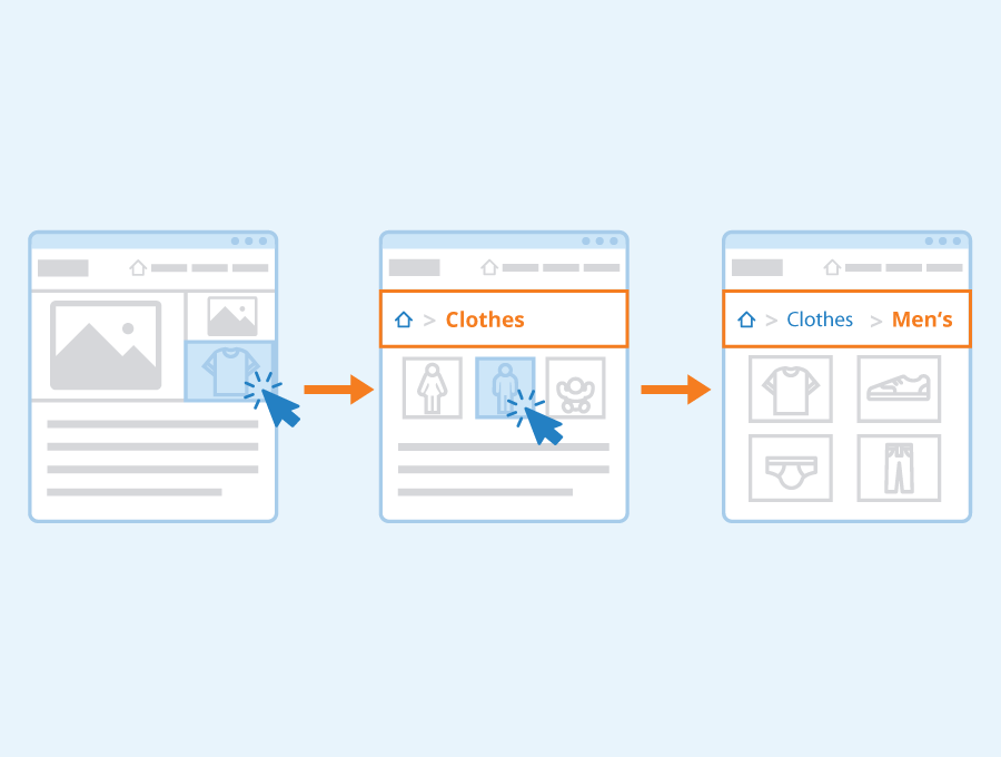
When it comes to maximizing eCommerce success, one of the most vital components is creating an effective navigation structure. A well-organized navigation system can make or break a user's experience on your website and impact how likely they are to return in the future. In this section, we will provide tips for organizing your categories and subcategories, using clear labels, grouping related items together, and avoiding too many levels of hierarchy. Organizing Categories
Organizing your categories in a logical manner is crucial to ensuring that visitors can easily find what they're looking for on your site. Start by identifying the main areas of interest or product types you offer and grouping them into broad categories. From there, consider whether any additional subcategories are needed within each category to further refine products into more specific groups.
When organizing these subcategories:
Use clear and descriptive labels: Avoid vague terms or jargon that may confuse users.
Group related items: Ensure all items within a category/subcategory are relevant so that users don't have to search through unrelated products.
Avoid too many levels of hierarchy: Limit yourself to no more than three layers (category > subcategory > sub-subcategory) as anything beyond this can become confusing.
Organizing Subcategories
Just like with categories themselves, effectively organizing subcategories means taking care not only with their titles but also where they sit in relation to other options available on your site. Consider both how frequently certain items might be searched for alongside similar products when deciding which level they belong at - if something receives consistent traffic across multiple sections then it could very well warrant its own dedicated spot higher up the chain!
When organizing these subcategories:
Use clear and descriptive labels
Group related items
Avoid too many levels of hierarchy
Clear Labels
Using clear labels throughout your site's navigation structure helps create consistency while also making it easier for shoppers who may not be familiar with industry-specific terminology or jargon to quickly understand where various products or sections are located. This also helps with SEO, as clear labels can help search engines better understand the content of your site.
When creating these labels:
Avoid jargon: Use language that is easy for anyone to understand.
Be consistent: Use the same terminology throughout your site's navigation structure.
Grouping Related Items
Grouping items together makes it easier for shoppers to find what they're looking for and enhances their overall experience on your website. By arranging related products in close proximity to one another within a category or subcategory, visitors can quickly compare options and make informed purchasing decisions.
When grouping related items:
Consider how customers shop: Think about common product pairings or frequently searched-for categories when deciding which items should be grouped together.
Keep things organized: Avoid cluttering pages with too many products as this can overwhelm users.
Avoiding Too Many Levels of Hierarchy
While it might be tempting to create multiple layers of categories and subcategories, doing so can actually hurt rather than help users' experiences on your site by making navigation confusing and frustrating. Aim for no more than three levels (category > subcategory > sub-subcategory), keeping in mind that any additional layers beyond this will likely lead to diminished returns in terms of usability and user satisfaction.
To avoid too many levels:
Limit yourself: Stick to no more than three levels whenever possible.
Focus on what matters most: Prioritize high-level categories that receive frequent traffic over less popular ones requiring multiple nested tiers.
Tips
In summary, here are some tips for creating an effective navigation structure:
Organize both categories and subcategories in a way that makes sense based on customer needs
Use clear, descriptive labels throughout your site's navigation structure
Group related items together within each category/subcategory
Limit hierarchy levels within the overall navigational layout to aid user understanding and avoid confusion.
Other considerations for navigation structure
When creating a navigation structure for your eCommerce website, there are several other factors to consider beyond the basics of clear labels and logical grouping. In this section, we will discuss three important considerations: mobile responsiveness, accessibility, and testing. Mobile Responsiveness
With more and more people accessing websites from their mobile devices, it's essential that your navigation structure is designed with this in mind. This means ensuring that it is easy for visitors to navigate your site on their smartphones or tablets.
One way to achieve this is by using responsive design techniques to ensure that your navigation menu adapts seamlessly across various screen sizes. Another option might be to use a hamburger menu icon which allows users to access the full list of options through a single tap.
Ultimately, the goal here should be to make sure that visitors can easily find what they're looking for without having to zoom in or struggle with tiny buttons on their screens.
Accessibility
Another crucial consideration when designing your navigation structure is accessibility. It's important to remember that not all visitors will have the same physical abilities or limitations when navigating your site. For example, someone who uses a screen reader may require additional information about each link in order to understand where it leads. Similarly, individuals who rely on keyboard shortcuts rather than mouse clicks may need alternative ways of accessing certain parts of your site.
By taking steps such as providing clear descriptions for links and ensuring proper focus states are implemented throughout the menu system you can create an accessible experience everyone can enjoy regardless of how they interact with technology.
Testing
Finally, it's essential that you test out different variations of your navigation structure before settling on one final version. This could include conducting A/B tests with two different layouts or simply observing user behavior through analytics data after launch.
Tracking metrics like click-through rates and bounce rates over time can help identify any issues users may encounter while trying navigate through various pages within the website allowing adjustments based off feedback received from users. By taking a data-driven approach to optimizing your navigation structure, you can help ensure that it provides an intuitive and efficient experience for all visitors.
Other Considerations
In addition to these three key considerations, there are several other factors to keep in mind when developing your navigation structure. For example, it's important to think about how the menu will look and function on different devices such as desktops, laptops or tablets; whether any internationalization is required based on location of audience or otherwise; and finally ensuring that the entire website has a consistent design language.
Overall, creating an effective navigation structure requires careful thought and planning across many different areas. By considering mobile responsiveness, accessibility needs testing variations of layout and keeping overall design best practices in mind at every step along the way you can create an eCommerce site that not only looks great but also offers users a seamless experience no matter how they choose to interact with it.
Conclusion
In conclusion, having a clear and consistent navigation structure is vital for eCommerce success. It helps users find what they need quickly and easily, leading to increased sales and customer satisfaction. By following the tips discussed in this article, website owners and managers can improve their navigation design and ultimately drive more conversions on their site. Remember to keep it simple, organized, and easy to understand. Don't be afraid to test different options until you find what works best for your audience. So take action today by implementing these strategies into your eCommerce website's navigation structure and watch as your sales soar!